Friday, February 28, 2014

Repetitions

As I mentioned in a post a while back, I was able to see the Van Gogh exhibition at the Phillips Collection in Washington D.C. called "Repetitions," which examined several series of Van Gogh paintings where he completed the same composition multiple times.

It was enlightening to see multiple versions of the same composition and to note the changes that he made in subsequent versions. In general, I found that I preferred the earliest versions of his "Repetitions" because they seemed fresher and more energetic.

My friends Roger and Clare took me the Van Gogh exhibition, and at one point while we were looking at a piece Clare asked if I had ever done multiple versions of the same composition. I replied that I had, but usually it was because I felt that the first attempt was a failure, and that I wanted to try again and improve upon it.

Well -  little did I know that I would have a chance to emulate the great Van Gogh -- and not because I thought my first painting was a failure.

+++

The painting I did before Christmas, "Winter Whites," was done in a single day (amazing) and I really liked how subtle, yet colorful, the painting was. My winter scenes are often very neutral or cool (all that ultramarine blue and burnt sienna!). This painting had wonderful touches of piney greens and hazy purples....I really enjoyed looking at it. I liked it so much that I used it on my Christmas cards.

"Winter Whites" - 12x12
On Christmas Eve, I returned from work to find a message on my answering machine from my friend Mary. She had received one of my cards, and she wanted to buy the painting.

This welcome news had a downside, however. I am working on paintings for my solo show this summer, and this was to be one of the pieces for the exhibit. But I also did not want to disappoint Mary, so I decided that I would do a second painting of the scene, at a different size, so she could have the first version, and I would still have a painting for my show.

Thus was born "Snowfall," which turned out to be a very different painting, and that divide intrigues me.

"Snowfall" - 15x15
Overall, I think this painting is much more lightly valued and cooler in tone. There is also a higher degree of finish in parts of the foreground, particularly in the foliage around the house.

I made a point of not looking at the first painting while working on the second. I wanted it to stand on its own merits, but the act of having painted the scene once before certainly affected me.

As was the case in the Van Gogh exhibit, I like the first version better. I think it's fresher and takes advantage of the impetuous and unexpected characteristics of the watercolor medium. The second feels more measured and quiet. I like it as well, but in style and atmosphere and mood it bears little resemblance to the first.

I would be interested to know what others think in comparing the two. And does anyone else engage in "Repetitions"?

Sunday, February 9, 2014

Tamarack website


I am a member of the Dickirson Gallery at Tamarack in Beckley, and the Tamarack Artisan Foundation has recently unveiled its new website, www.TamarackFoundation.org.

An important feature of the new website is an interactive artisan directory that includes a search mechanism to find artists by name, geographic location, medium, open studio policy, county, town, etc.

Visit the website at www.TamarackFoundation.org.

Wednesday, February 5, 2014

Pink Sugar

"Pink Sugar" - 5"x5"
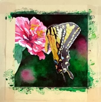
So here is the finished version of my annual commission for my friend. I did a lot of work to develop the details of the butterfly, and, even though I loved the hard contrasts in the Zinnia's petals, I decided that I had to knock it back a bit so it wouldn't compete with the butterfly too much. So I think the brightly lit area at the top of the wings is the point of entry now, with lots of places to explore within the composition.

The other significant change was the pink blob toward the bottom. It kept getting in the way, I decided. To fulfill one of the "rules" listed in my previous post (little to no detail beyond the subject) it had to go. So the area was scrubbed and dark greens dropped in. I think that change helped things immensely.

And I'm happy to report that my friend was pleased with her painting!

Sunday, February 2, 2014

Butterfly commission


Each January I have a "commission" from a friend and co-worker. I put the word commission in quotation marks because she allows me to choose the subject of the painting, so I have freedom in this project that most commissions would not normally afford.

I keep her paintings within the parameters of floral subjects, with a couple of still life compositions thrown in. We counted up this year, and she now has six of my pieces, five of them being original paintings (one is a print because the original that she wanted had already sold by the time she saw it. Since then, I paint works just for her each January to ensure that she gets the original).

***

I must give credit to my mother for the inspiration of this project. She grows many, many flowers around her house, through all seasons. She now has a nice camera that she's been using to capture the fleeting glory of her blooms.

In this case, a large Tiger Swallowtail had taken up residence among a group of pink Zinnias, and the butterfly had no intentions of leaving his post while mom snapped photographs. So she has several closeups of blooms with the butterfly hard at work extracting sweet gifts. I saw the images, and immediately thought of my commission project.


That said, I still had some lessons to learn from this project. I initially started out with another idea -- with an image that had multiple blooms and I liked the idea of using the blooms to lead the eye around the piece. However, this is a small painting (only 5x5), and once I got into it, I realized that there was more in the composition that the space could easily accommodate. So that painting was halted mid-stream, and I went back to the drawing board, literally.

I thought about the paintings that I see other accomplished floral painters create, and I decided there were essential elements to making these compositions work, particularly when the painting is quite small.

  1. Tight focus on a primary subject
  2. Little to no detail beyond the subject
  3. Extreme value contrasts
  4. Dramatic lighting

With these "rules" in mind, I settled on a new image, mostly because I liked the little shadows some petals cast on the petals below. I thought that, plus the glow of light through the butterfly's wing, added the "dramatic" element, as well as helped with the value contrasts. I then cropped tightly on the subject and ignored all the background elements.

At this point, the painting is close to finished, but I have work yet to do with the butterfly. Stay tuned for the final product!