Showing posts with label values. Show all posts

Sunday, July 24, 2016

Long absence, acrylic and plein air

It's been a tremendously long time since I've posted anything. Unfortunately, I'm still not painting in a serious way, but I've tried to dabble in a couple of new things to try and restart my creative life.

Yesterday, I took a plein air class at the Museum of the Shenandoah Valley in Winchester, Va., taught by a local art teacher, Cindy Redmon.

I've not really done plein air before (I did a plein air demo of sorts years ago at the local craft co-op, where I mucked around tremendously), and certainly not painted in a group setting for a while.

The other spin on this class was that the medium was acrylic, which I have no experience with.

Add in the triple-digit heat index in the Shenandoah Valley, and it certainly looked like it would be a very long day.

+++

However, it ended up being a very enjoyable experience. The gardens at MSV, which are part of the Glen Burnie estate, are magnificent. The class coordinator, Courtney, was great at taking care of our needs (and providing lots of water). And Cindy did a great job leading the class.

The sketch I've posted here is of the statue at the end of the Pleached Allée. I completely lost the light as I moved down the figure, so it doesn't make a lot of sense, but I did move quickly enough to get the light set on her face. I think that's the biggest challenge of plein air....the sun moves so quickly that the scene completely changes in no time.

The acrylic was really frustrating for me at the onset, and still was frustrating by the end of the day (the value shift as it dries is maddening), but it was oddly fun to make a different kind of mess. I'm not switching to acrylic, but I think I would like to play with an opaque medium a bit more.

If you are traveling through the Valley, take time to visit MSV and see the gardens. Learn more at https://www.themsv.org/

Friday, September 18, 2015

Working on block printing


I'm making a serious attempt at a linocut for the first time in years (actually decades, to be truthful).

It's based on a watercolor I did earlier this year. I really liked the stark value contrasts in the watercolor, and thought it might work as a block print, especially when I saw the painting converted into grayscale.

However, I ran into problems trying to plan the linocut (I could not make my mind work negatively using "positive" tools - black ink on white paper). So I found black sketch paper and a white charcoal pencil, and did my planning with that (at left in the image above).

So now I've started cutting the block. I hope this works out, but I'm prepared to try another one. I know I'm really, really rusty at this. After all, it was 1990 when I last was doing lino and wood cuts(!)

Wish me luck.


Friday, March 28, 2014

Tangled up in green


I may have gone off the deep end with this one. I'm trying to break down a tangle of vines without getting overwhelmed by the mass of potential details.

So I've resorted to masking fluid (didn't I recently write that I didn't like using it?) to assist me in my task.

I've painted lighter areas of leaves, masked out shapes within those areas, and returned (when dry) to add darker values. Mask again, wait, and repeat with a darker wash. And repeat again.

At this point, the painting reeks of latex and ammonia, and I'm wondering what things actually look like under all that gooey masking fluid.

Stay tuned!


Wednesday, February 5, 2014

Pink Sugar

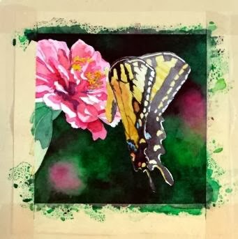
"Pink Sugar" - 5"x5"
So here is the finished version of my annual commission for my friend. I did a lot of work to develop the details of the butterfly, and, even though I loved the hard contrasts in the Zinnia's petals, I decided that I had to knock it back a bit so it wouldn't compete with the butterfly too much. So I think the brightly lit area at the top of the wings is the point of entry now, with lots of places to explore within the composition.

The other significant change was the pink blob toward the bottom. It kept getting in the way, I decided. To fulfill one of the "rules" listed in my previous post (little to no detail beyond the subject) it had to go. So the area was scrubbed and dark greens dropped in. I think that change helped things immensely.

And I'm happy to report that my friend was pleased with her painting!

Sunday, February 2, 2014

Butterfly commission


Each January I have a "commission" from a friend and co-worker. I put the word commission in quotation marks because she allows me to choose the subject of the painting, so I have freedom in this project that most commissions would not normally afford.

I keep her paintings within the parameters of floral subjects, with a couple of still life compositions thrown in. We counted up this year, and she now has six of my pieces, five of them being original paintings (one is a print because the original that she wanted had already sold by the time she saw it. Since then, I paint works just for her each January to ensure that she gets the original).

***

I must give credit to my mother for the inspiration of this project. She grows many, many flowers around her house, through all seasons. She now has a nice camera that she's been using to capture the fleeting glory of her blooms.

In this case, a large Tiger Swallowtail had taken up residence among a group of pink Zinnias, and the butterfly had no intentions of leaving his post while mom snapped photographs. So she has several closeups of blooms with the butterfly hard at work extracting sweet gifts. I saw the images, and immediately thought of my commission project.


That said, I still had some lessons to learn from this project. I initially started out with another idea -- with an image that had multiple blooms and I liked the idea of using the blooms to lead the eye around the piece. However, this is a small painting (only 5x5), and once I got into it, I realized that there was more in the composition that the space could easily accommodate. So that painting was halted mid-stream, and I went back to the drawing board, literally.

I thought about the paintings that I see other accomplished floral painters create, and I decided there were essential elements to making these compositions work, particularly when the painting is quite small.

  1. Tight focus on a primary subject
  2. Little to no detail beyond the subject
  3. Extreme value contrasts
  4. Dramatic lighting

With these "rules" in mind, I settled on a new image, mostly because I liked the little shadows some petals cast on the petals below. I thought that, plus the glow of light through the butterfly's wing, added the "dramatic" element, as well as helped with the value contrasts. I then cropped tightly on the subject and ignored all the background elements.

At this point, the painting is close to finished, but I have work yet to do with the butterfly. Stay tuned for the final product!

Monday, October 21, 2013

Solitude

"Solitude" - 8x8

So after many hesitant revisions, this little painting joins the ranks of the Wardensville series.

In many ways, this project may be the closest I've come to following Bill Vrscak's advice: (see my earlier blog post on Bill Vrscak) ..."the best compositions are developed via sketching and simplification -- to [Vrscak] a painting should not be an exact copy of a scene or subject because that's what photography is for. Instead, painters must remember that what is on the surface of the paper is far more important than what the painter is seeing."

Well, given the quality of my source photograph, sketching and simplification were my only options.


I took the photo with my cell phone while on a morning walk. I don't know what attracted me to the scene, given all the obstacles between me and the focal point. But I know that I often see "glimmers" of paintings as I walk and/or drive around. If I pause and look more closely, the vision seems to vanish. So I'm beginning to trust my instincts, snap a photo, and ask questions later.

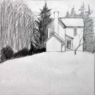
So here was my first simple sketch of the scene:

First sketch
It's very rough, but what I liked was the contrast between the background foliage shapes and the hard white geometry of the house.

Working to refine the shape of the house, I then did this sketch. This drawing also determined the direction of the light and how the shadows were cast on the different sections on the house. Additionally, I moved the house "up" on the hill.

Second sketch
A couple of watercolor value paintings were next, which I had posted in an earlier blog entry:

Value #1
Value #2
The purpose of these little paintings was to figure out how I wanted to break up the mass of foliage that surrounds the house. I knew the contrast between the large pine to the left and the house was critical, but I wanted to play with other values around those key elements.

Now it was time to paint...


In this early stage, I tried, per Bill Vrscak's advice, to block in big shapes first. I also  tried to make the outlines of those shapes interesting, and to vary the colors within the shapes so they wouldn't be flat and boring. Since the light was hitting from the right, I used more yellows to that side, and added cooler blues as I worked to the left.

From the value paintings, I had decided to not worry about any details in the foliage, and to push it all to the background. However, when looking at the painting at this point, I began to feel that it was too simple and too boring. So I stopped working on it for quite a while, and kept thinking about it. Finally I decided that I had to lift some of the wash to the left side, and develop some sense of hanging foliage that would add depth to the foreground elements. So the next stage shows that mass of foreground foliage as it starts to develop.

Along the way, you may have noticed that I eliminated the little tree that had been growing in front of the house. I had the tree in my pencil sketches, but in distilling the lessons of those early sketches, I decided that it was the shape of the house against the dark background that drew my interest. That contrast seemed dramatic, perhaps even mysterious. Obscuring that stark contrast with the mid-ground tree seemed superfluous, so I eliminated the tree from the design.

At this stage, I had also worked to break up the foliage areas surrounding the house, and developed the foreground to add texture and interest to what otherwise could be a large boring shape.

To finish up, I strengthened the cast shadows in the house, and added some very slight touches of detail. I didn't want to fuss over the house, and I think I kept it fairly simply, yet it reads in a realistic manner.
"Solitude" - 8x8

Monday, September 2, 2013

Value studies


I am working from a really poor photo reference, so I'm essentially making this scene up. So that should make for a good painting...if I had the skill set of Bill Vrscak. But I'm certainly not there yet, so this challenge worries me.

So, I've resorted to doing some little value paintings to try to figure out how I want to develop all the foliage around the structure. Here are two of the options.

I guess it's time to scale things up to full size...