Showing posts with label mixing techniques. Show all posts

Sunday, June 16, 2013

Bill Vrscak workshop in Morgantown


Photo by D. Byron Witt and used with permission.
Bill Vrscak (left) talks to participants at the
Morgantown Art Association's spring workshop in April 2013.

Photo sourced from Morgantown Art Association's Facebook page:
https://www.facebook.com/pages/Morgantown-Art-Association/304517989577522


I'm going to try to encapsulate my experience at the Bill Vrscak workshop in early April, hosted by the Morgantown Art Association (www.morgantownartassociation.com). Bill is a painter and graphic artist from the Pittsburgh area, and I've known about his watercolors for quite some time. (You can see examples at his website http://www.billvrscak.com/) So it was with great excitement that I learned that MAA was organizing a four-day watercolor workshop with him.

Bill demonstrated each morning, and then we turned to our own boards and attempted to nail his ideas and techniques down with brush and paper. At times I would vaguely feel that I was "getting it" and at other times I flat out didn't, but I never felt extremely frustrated. I could see such value in his ideas and suggestions that I wanted to absorb everything to the fullest extent possible.

I would like to share a detailed record of the workshop, but there is so much that I learned over the course of the four days that I don't know if I can really do justice to the full experience. But I will try.

I'll synthesize Vrscak's philosophy, as I understood it, into one short sentence: The best watercolors do more with less.

That one statement applies to nearly every stage of an individual painting's development. I will try to explain that central idea in a step-by-step way.

Here is one of Bill Vrscak's sketches as he begins to develop a painting.
SKETCHING: For Vrscak, the best compositions are developed via sketching and simplification -- to him a painting should not be an exact copy of a scene or subject because that's what photography is for. Instead, painters must remember that what is on the surface of the paper is far more important than what the painter is seeing.

So, Vrscak  pares down the subject matter and looks for what he finds vital. And one area in the composition should be of greatest importance -- this is the point of entry for a viewer  and everything else is secondary. Sketching helps a painter develop that entry point and then simplify the rest of the scene. As you can see in the photograph of one of his sketches (shown above), there's nothing elaborate about the sketch. It's a road map of sorts -- the relative shapes of the masses have been worked out, there's a hierarchy of dark and light values, and the overall composition within the frame has been established.

A painting in progress, reflected in the overhead mirror.
Here you can see Vrscak's limited palette.
THE PALETTE: Next, Vrscak only uses six colors on his palette - a split primary palette composed of a warm and cool version of Yellow, Red and Blue. The colors he used in our workshop, listing the cool version in each pair first followed by the warm version, were Aureolin and Cad Yellow, Permanent Alizarin Crimson and Cad Red, and Winsor Blue (Green Shade), and Ultramarine Blue.

He said he will mix those up from time to time, substituting Cobalt Blue for Ultramarine, for instance, and maybe he will add some specific color to the palette, such as a earth color, for a particular subject. But for the most part, his large, white palette had mostly empty wells. He said he went to this limited palette some time ago because he wanted to simplify his color mixes and concentrate more on values. The limited palette also makes it easier for him to replicate color mixes, and after years of using it, he knows exactly what ratios of which colors will produce what he needs at a given time with minimal fuss.
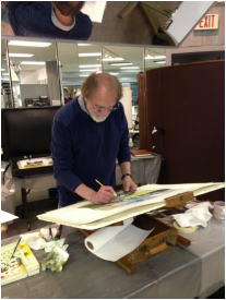
Photo by D. Byron Witt and used with permission.
Bill Vrscak
Photo sourced from Morgantown Art Association's Facebook page:
https://www.facebook.com/pages/Morgantown-Art-Association/304517989577522
THE BRUSHES: Vrscak says he likes flats, and he specifically likes flats with extra long bristles. Often marketed as "one stroke" brushes, I found these brushes to be a revelation. I've always liked the look of paintings that obviously were created using flats -- but when I have tried to use flat wash brushes, they have always felt too stiff and seemed to pull off as much pigment as I was trying to put down. I have a massive collection of flat brushes that I have purchased and then set aside because I did not like how they felt.

However, these "one stroke" versions have a much softer feel, more like a nice pointed round. Vrscak said he likes them because of the amount of pigment they can hold. The fewer times he has to go back into his palette to pick up pigment, the better. They also have nice spring and flexibility and can make great "marks." He uses the edges in smaller areas and tries to use as big a brush as he can for as long as he can. He warns that relying on only small brushes leads to excessive concern for the detailed areas, and a loss of vision of the painting as a whole.

In this demo painting by Bill Vrscak, broad washes went down first, followed by a limited number of detailed marks. An obvious entry point, nice value contrasts, interesting contours, and just the right amount of texture make this a wonderful example of a watercolor painting. I am very proud to say that I am now the owner of this painting!!!
THE PAINTING: As for the painting itself -- Vrscak works to establish the big areas first with broad washes applied with big brushes, and he gets most of the white of the paper covered quickly, because it helps him to make more accurate value judgements He also establishes a dark early in a painting's development for the same reason.

He slants his paper as a way of controlling washes and eliminating back runs, and he aways makes subtle changes in the color mixes of the large washes. A good example of this is in the photo above with the distant mountain to the right. A slighter pinker color grades into a greyish green to the right, with a touch of a greyish purple at the base. It's simple, yet so effective. Many more slight color shifts can be seen in the large foreground area. These touches help keep large washes from becoming boring and flat, yet they are subtle and don't distract from the focal point. The overall effect is a feast for the eyes.

Vrscak's goal with the really large areas is to get something down on the first application, make it look interesting, and not go back into it. And that's the secret of "fresh" watercolors. Don't mess with it!

As the painting moves along, smaller brushes are used to develop the important bits of the painting, but only those most important parts get special treatment and more work. Vrscak reiterates that getting too concerned with all the details all over a painting means that you have lost the focus of the painting.

Here is another demo painting by Bill Vrscak from the Morgantown workshop. This painting still has more development in store, but you can see just how much can be accomplished with the skillful application of large value masses.
FINALLY: More good advice from Vrscak: Make interesting washes, interesting shapes and interesting contours. Accept that a watercolor is a simply a collection of flat shapes and marks and that they must relate to one another for a painting to be successful. So arrange the marks in a pleasing way and keep it simple!

This really was a wonderful workshop for me, and it came at the right time in my development as an artist. I'm beginning to get a sense of what I'm good at doing, and I really enjoy playing with and controlling compositional elements now, so much of what Bill Vrscak offered us in the way of advice and ideas was exceptionally helpful to me. I absolutely would attend another of his workshops and would encourage any watercolorist at any level to take from him as well. He is a great teacher as well as being a great painter, and that is a combination that I really admire.


Saturday, May 18, 2013

Side Alley


Side Alley - 8"x8"
So another piece of the Wardensville series is done. I really like the colors with this one...perhaps Bill Vrscak is right with his limited split primary palette! I know that I really struggle with mixing greens, so I want to play with this concept more and see if it helps solve some problems that have halted my progress on some paintings.

Now, regarding my news about this series....in addition to the small showing of the paintings at the Wardensville High School alumni dinner in September, I am donating one painting to the Wardensville Scholarship Fund Association. I'm still not sure if they have decided on a silent auction, a live auction, or on chances, but the proceeds from the sale of the donated painting will benefit the scholarship fund.

The subject of this painting will be the old Wardensville School -- I won't reveal more than that yet. Stay tuned to see how it looks!

Sunday, April 21, 2013

Alley


Here is an in-progress shot of another painting in the Wardensville series...I'm trying out some ideas from the recent Bill Vrscak workshop I took at the Morgantown Art Association. You can see some of Bill's wonderful paintings at his website www.billvrscak.com.

Bill uses a split primary palette - warm and cool versions of yellow, blue and red. He also stresses the use of value sketching to develop compositions, and believes that the best paintings come from the worst references -- the more the artist has to create to make a composition work, the better. Otherwise, he wonders, why go through the effort of painting a scene from a beautiful photograph? The photographer has already done the work and there's little that the artist can add to the scene.

I filled up a small notebook as he talked and worked on demo paintings -- he shared so many wonderful ideas with the group. I need to sit down and retype everything to help me digest all of the useful information.

There is good news regarding the entire Wardensville series that I'd like to share. I'm going to have a small showing of the paintings at the Wardensville High School alumni dinner this fall. I thought it would be a good venue with folks who know the town intimately. I hope the group will enjoy my efforts to bring life to the scenes we often overlook.

There's another announcement regarding the alumni dinner that I'd like to make, but I think it deserves its own post...stay tuned!

Saturday, October 6, 2012

First study in the series


Well, this is the first little study I've done in the series. I really liked the original pencil sketch, so when I moved to this stage, I decided to keep things very simple. I just wanted to know if the idea would work with a limited palette and simple masses of value and hue.

The color palette is Quin Gold, Cobalt Blue and Permanent Alizarin Crimson. I also made a point of mixing the colors on the paper, rather than on my watercolor palette.

Friday, January 21, 2011

Our House - Finished


The saga of painting my father's childhood home ended this Christmas when I finally presented the finished piece to him.

I started this project back in the early part of 2009, but it had roots in an even earlier date when my father first asked me for this painting.

The simple structure on my grandparent's farm burned in the 1970s. Very few images from the family photo albums included the house, and when it did appear, it was always as a background image, mostly cropped out of the frame.

Here's an example of one of the photo references I was working from, and this is one of the more complete views of the structure.


I detailed the obstacles in the project in earlier posts from 2009. You can find the posts by clicking on the "Our House" label to the left. The lack of reference photos pushed me into constructing a model of the house in foamcore, and then setting up lights to create the illusion of sunlight and shadows.

The large tree next to the house posed its own problems. I eventually hit upon photographing a pine from my yard, which ended up being a close match to the kind of rough, irregularly shaped tree dad remembered.

I completed a drawing of the scene in a horizontal landscape format, started a color study of the composition -- and discovered it was all wrong. There were too many unknowns with the pasture field and steep hill surrounding the house that I didn't know how to solve.

I went back to the drawing board -- literally.

Early in 2010, I finally managed a drawing of the house in a new vertical composition that eliminated most the background hillside. The emphasis in this view would be the house, not the setting. It was probably too simple of a composition, with little to help lead the eye around the frame, but I had come to the conclusion that in this case, that was okay. The house was what interested my father, and if I could render that in a realistic manner, he would be satisfied.

I then started developing a series of tiny color studies to work out a palette. I wanted to limit my palette severely, to concentrate on value and shape rather than on a rainbow of colors that might distract.

My first plan was to limit myself to French Ultramarine Blue and Burnt Sienna -- my favorite set of complements.


But when I tried that, it didn't work. I had difficulty distinguishing the brightly lit front planes of the house from the background hill, for example. The Sienna also was adding too reddish a tint to the tar-paper siding that covered the house. You can see my difficulties in the first color study to the left.

I could have tried another brand of Burnt Sienna (W&N's BS leans toward red; other brands can lean toward yellow), but I already felt too constricted by the severely limited palette.

I then experimented with a touch of burnt umber, quin gold, added cobalt violet and then moved back toward ultramarine violet.

You can see the progression of color modifications in these studies. These two are a sampling of my endeavors. I completed six in all, and never was satisfied with any of them.

I also considered modifying my composition to a square. My Christmas card for 2010 was one of my experiments along this line. Ultimately, I decided against it. The house was so dominant in the scene that I felt the large grassy foreground was needed to offset its weight, almost in the sense of a cantilever.

I finally worked out a simple palette of FUB, Burnt Umber, a touch of Hookers Green, and Ultramarine Violet. I did a larger color study with this set of pigments, and finally found what I was looking for.


In some ways, I like this little 5x7 study better than the full-size painting, which is 16x22. I like the softer edges of the house, I think. It seems as though the light is softly bouncing off it, and it has more of a late evening quality because of the light.

The full size painting, with its crisper edges, feels harsher. But in that size, I didn't quite know how to soften it. So I left it alone.

In the end, I understood that I was painting this for my father, not for me. For him, the crisper edges helped to solidify memories that had grown dim over the decades. He was pleased. And that was all I needed from this project.

Thursday, July 30, 2009

Enough with 'New Ideas'


I think it's time to say "enough" with this test painting. I had lost interest in it a couple of weeks ago, and then I had my young visitors, so I hadn't returned to it.

Most of the updates concern the foreground: the high weeds around the buildings and the pasture in front.

I didn't do anything with the secondary building to the far left. I think it was a compositional mistake to include it, or at least it was a mistake to let its roof be so dominant and so light.

I played with using white crayon after painting the first yellows for the high weeds to help retain that color and created a more ragged edge for the plants once I brought the reds and mixed blacks of the barn's sides and shadows down against the plant's tops. It wasn't all that successful a technique. I think I would have to use a clearer wax resist to try it again. The white crayon dulled the yellow too much, I think.

Friday, July 3, 2009

New ideas


I'm trying out some of the ideas from Lynn Ferris' workshop, specifically the idea of mixing colors on the paper rather than on the palette.

I did a fast sketch of this scene on a piece of 140# cold press Arches, stretched over a board. Then I plunged in -- and immediately hated how it was turning out.

But I keep plugging along on this. I have no plans for it -- it's purely an experimental exercise, but it's slowly growing on me.

What I'm most unhappy with is the background foliage. It feels like a flat, green mass, with very little sense of depth.

But what I'm most pleased about are the blacks, the shadows within the building. I'm worked hard with using the complements together there, mixed on the paper. (They're permanent Alizarin Crimson and Pthalo Green, by the way).

So an interesting experiment so far. I'll see how it comes out.