Showing posts with label step-by-step. Show all posts

Friday, September 18, 2015

Working on block printing


I'm making a serious attempt at a linocut for the first time in years (actually decades, to be truthful).

It's based on a watercolor I did earlier this year. I really liked the stark value contrasts in the watercolor, and thought it might work as a block print, especially when I saw the painting converted into grayscale.

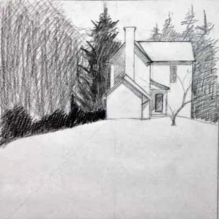
However, I ran into problems trying to plan the linocut (I could not make my mind work negatively using "positive" tools - black ink on white paper). So I found black sketch paper and a white charcoal pencil, and did my planning with that (at left in the image above).

So now I've started cutting the block. I hope this works out, but I'm prepared to try another one. I know I'm really, really rusty at this. After all, it was 1990 when I last was doing lino and wood cuts(!)

Wish me luck.


Wednesday, April 23, 2014

Ivy League

"Ivy League"  - 20"x14"
 The masking fluid mess turned out to be a successful painting, so the extra effort was worth it this time.

I'm beginning to find that I like the combination of hard edges, consistent with a classic poster art appearance, and the soft willy-nilly look of painting watercolors wet-into-wet.

In the case of this painting, I see that juxtaposition most in the areas of the vine where the reds, yellows and greens literally run through an area of leaves. The outlines created by the leaf shapes against a darker background make those leaves individual, but the variable flow of color within the joined silhouettes make them a unit.

If you'd like to see some images of the painting while in progress (and with all that icky masking fluid all over the leaves), here they are!


Friday, March 28, 2014

Tangled up in green


I may have gone off the deep end with this one. I'm trying to break down a tangle of vines without getting overwhelmed by the mass of potential details.

So I've resorted to masking fluid (didn't I recently write that I didn't like using it?) to assist me in my task.

I've painted lighter areas of leaves, masked out shapes within those areas, and returned (when dry) to add darker values. Mask again, wait, and repeat with a darker wash. And repeat again.

At this point, the painting reeks of latex and ammonia, and I'm wondering what things actually look like under all that gooey masking fluid.

Stay tuned!


Wednesday, February 5, 2014

Pink Sugar

"Pink Sugar" - 5"x5"
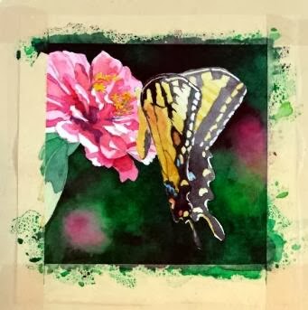
So here is the finished version of my annual commission for my friend. I did a lot of work to develop the details of the butterfly, and, even though I loved the hard contrasts in the Zinnia's petals, I decided that I had to knock it back a bit so it wouldn't compete with the butterfly too much. So I think the brightly lit area at the top of the wings is the point of entry now, with lots of places to explore within the composition.

The other significant change was the pink blob toward the bottom. It kept getting in the way, I decided. To fulfill one of the "rules" listed in my previous post (little to no detail beyond the subject) it had to go. So the area was scrubbed and dark greens dropped in. I think that change helped things immensely.

And I'm happy to report that my friend was pleased with her painting!

Sunday, February 2, 2014

Butterfly commission


Each January I have a "commission" from a friend and co-worker. I put the word commission in quotation marks because she allows me to choose the subject of the painting, so I have freedom in this project that most commissions would not normally afford.

I keep her paintings within the parameters of floral subjects, with a couple of still life compositions thrown in. We counted up this year, and she now has six of my pieces, five of them being original paintings (one is a print because the original that she wanted had already sold by the time she saw it. Since then, I paint works just for her each January to ensure that she gets the original).

***

I must give credit to my mother for the inspiration of this project. She grows many, many flowers around her house, through all seasons. She now has a nice camera that she's been using to capture the fleeting glory of her blooms.

In this case, a large Tiger Swallowtail had taken up residence among a group of pink Zinnias, and the butterfly had no intentions of leaving his post while mom snapped photographs. So she has several closeups of blooms with the butterfly hard at work extracting sweet gifts. I saw the images, and immediately thought of my commission project.


That said, I still had some lessons to learn from this project. I initially started out with another idea -- with an image that had multiple blooms and I liked the idea of using the blooms to lead the eye around the piece. However, this is a small painting (only 5x5), and once I got into it, I realized that there was more in the composition that the space could easily accommodate. So that painting was halted mid-stream, and I went back to the drawing board, literally.

I thought about the paintings that I see other accomplished floral painters create, and I decided there were essential elements to making these compositions work, particularly when the painting is quite small.

  1. Tight focus on a primary subject
  2. Little to no detail beyond the subject
  3. Extreme value contrasts
  4. Dramatic lighting

With these "rules" in mind, I settled on a new image, mostly because I liked the little shadows some petals cast on the petals below. I thought that, plus the glow of light through the butterfly's wing, added the "dramatic" element, as well as helped with the value contrasts. I then cropped tightly on the subject and ignored all the background elements.

At this point, the painting is close to finished, but I have work yet to do with the butterfly. Stay tuned for the final product!

Wednesday, January 15, 2014

Our Wheel of Fortune


Since this painting is too large for me to easily scan and assemble on my little flatbed scanner (scan area of 8.5x11), I have to photograph it, which requires setting up umbrella light stands, etc. And that requires moving most of the furniture in my small room. So the final image for this painting will have to wait for a while....hopefully when I have another painting or so finished, so I can make the most of the elaborate lighting setup.


So, I snapped some really awful photos with my cell phone camera, and tried to do a rough color adjustment on them...but the tones are really off and are washed out. So I'll have to content myself with posting these little snippets of the final painting for now. Let's say that I am pleased with the final product.


Tuesday, December 31, 2013

Progress

Things are still developing with the new painting. I think I will have to take a lot of time to develop the reflections in a realistic manner.

Most of my attention at the moment is focused on balancing the overall values. There are lots of areas in this composition that have the potential to attract too much attention, especially with all the bright, reflective highlights. So I'm working on tamping down the contrasts in the less important areas.

I've got an army of brushes at work....I'm using the RS White Sable flats, and my usual synthetic rounds, but I've also got three Princeton Neptune brushes at work. They are made with "synthetic squirrel," and they allow me to go back into areas without disturbing the underlying washes. They also are a huge help in blending.

Saturday, December 28, 2013

Heavy metal


I am steadily working on my current project. I'll hold off identifying the subject right now, but I think it might be familiar to some. I think it's an unusual subject, and it's one that I've contemplated doing for some time. The demands of the Wardensville series has finally pushed me to it!

This is my largest painting this year...15x15...and doing these big, wet washes has been a challenge. I think that's why I avoid larger works. It takes a lot of concentration to keep things under control when you have washes running all over the place. This size requires the use of large, flat brushes, which hold more pigment (and more water!).

That's where I often make a mess of things, because I'll try to "fix" something, and then a massive bloom will erupt, and then I'll mess up all sorts of other areas to "fix" the solution to my first "fix," and then it spirals out of control. Agh! Then I swear off big brushes and return to my little paintings for a while.

But, in this case, so far so good. I'm finished with the big areas, so I can concentrate on developing the forms.

I'm working essentially with three colors - a cool blue and cool yellow, and a warm red. I like the neutrals produced by this mix.

Monday, October 21, 2013

Solitude

"Solitude" - 8x8

So after many hesitant revisions, this little painting joins the ranks of the Wardensville series.

In many ways, this project may be the closest I've come to following Bill Vrscak's advice: (see my earlier blog post on Bill Vrscak) ..."the best compositions are developed via sketching and simplification -- to [Vrscak] a painting should not be an exact copy of a scene or subject because that's what photography is for. Instead, painters must remember that what is on the surface of the paper is far more important than what the painter is seeing."

Well, given the quality of my source photograph, sketching and simplification were my only options.


I took the photo with my cell phone while on a morning walk. I don't know what attracted me to the scene, given all the obstacles between me and the focal point. But I know that I often see "glimmers" of paintings as I walk and/or drive around. If I pause and look more closely, the vision seems to vanish. So I'm beginning to trust my instincts, snap a photo, and ask questions later.

So here was my first simple sketch of the scene:

First sketch
It's very rough, but what I liked was the contrast between the background foliage shapes and the hard white geometry of the house.

Working to refine the shape of the house, I then did this sketch. This drawing also determined the direction of the light and how the shadows were cast on the different sections on the house. Additionally, I moved the house "up" on the hill.

Second sketch
A couple of watercolor value paintings were next, which I had posted in an earlier blog entry:

Value #1
Value #2
The purpose of these little paintings was to figure out how I wanted to break up the mass of foliage that surrounds the house. I knew the contrast between the large pine to the left and the house was critical, but I wanted to play with other values around those key elements.

Now it was time to paint...


In this early stage, I tried, per Bill Vrscak's advice, to block in big shapes first. I also  tried to make the outlines of those shapes interesting, and to vary the colors within the shapes so they wouldn't be flat and boring. Since the light was hitting from the right, I used more yellows to that side, and added cooler blues as I worked to the left.

From the value paintings, I had decided to not worry about any details in the foliage, and to push it all to the background. However, when looking at the painting at this point, I began to feel that it was too simple and too boring. So I stopped working on it for quite a while, and kept thinking about it. Finally I decided that I had to lift some of the wash to the left side, and develop some sense of hanging foliage that would add depth to the foreground elements. So the next stage shows that mass of foreground foliage as it starts to develop.

Along the way, you may have noticed that I eliminated the little tree that had been growing in front of the house. I had the tree in my pencil sketches, but in distilling the lessons of those early sketches, I decided that it was the shape of the house against the dark background that drew my interest. That contrast seemed dramatic, perhaps even mysterious. Obscuring that stark contrast with the mid-ground tree seemed superfluous, so I eliminated the tree from the design.

At this stage, I had also worked to break up the foliage areas surrounding the house, and developed the foreground to add texture and interest to what otherwise could be a large boring shape.

To finish up, I strengthened the cast shadows in the house, and added some very slight touches of detail. I didn't want to fuss over the house, and I think I kept it fairly simply, yet it reads in a realistic manner.
"Solitude" - 8x8

Sunday, April 21, 2013

Alley


Here is an in-progress shot of another painting in the Wardensville series...I'm trying out some ideas from the recent Bill Vrscak workshop I took at the Morgantown Art Association. You can see some of Bill's wonderful paintings at his website www.billvrscak.com.

Bill uses a split primary palette - warm and cool versions of yellow, blue and red. He also stresses the use of value sketching to develop compositions, and believes that the best paintings come from the worst references -- the more the artist has to create to make a composition work, the better. Otherwise, he wonders, why go through the effort of painting a scene from a beautiful photograph? The photographer has already done the work and there's little that the artist can add to the scene.

I filled up a small notebook as he talked and worked on demo paintings -- he shared so many wonderful ideas with the group. I need to sit down and retype everything to help me digest all of the useful information.

There is good news regarding the entire Wardensville series that I'd like to share. I'm going to have a small showing of the paintings at the Wardensville High School alumni dinner this fall. I thought it would be a good venue with folks who know the town intimately. I hope the group will enjoy my efforts to bring life to the scenes we often overlook.

There's another announcement regarding the alumni dinner that I'd like to make, but I think it deserves its own post...stay tuned!

Saturday, October 6, 2012

First study in the series


Well, this is the first little study I've done in the series. I really liked the original pencil sketch, so when I moved to this stage, I decided to keep things very simple. I just wanted to know if the idea would work with a limited palette and simple masses of value and hue.

The color palette is Quin Gold, Cobalt Blue and Permanent Alizarin Crimson. I also made a point of mixing the colors on the paper, rather than on my watercolor palette.

Wednesday, August 8, 2012

Background in


After several layers, I ended up with the background being too dark and overwhelming, so I masked over the figure and scrubbed out some of the background with a natural sponge. 

The rough treatment helped -- it's closer to the mid-range value I had originally intended, but up close you can see the bumps and bruises suffered by the paper. I really must get out of this scrubbing habit.

Sunday, July 29, 2012

Bright Eyes


Here is another of the class exercises from Jane Paul Angelhart's class. I did most of this while the workshop was going on, with a few extra touches done since. I think I need to get a background started before doing much more with this little girl's face. It's hard to gauge the shadows and cast shadows against the plain white background.

Sunday, July 15, 2012

Returning to A.'s portrait


While I was able to look at my class exercise portrait with new understanding, I also pulled out my portrait of A. And I could see much that needed refined in her face as well. Here's where it is at the present time. If you look to my earlier post about A., I think you can see some of the changes I've made.

It's a trifle difficult to explain everything that I've done (I get in the moment and forget), but mostly I started seeing more of the nuance in the shadowed shapes that create the roundness of the facial features.

I had tried at an earlier stage to darken the far side of her face, but I lost my nerve and blotted out most of what I had done. This time, with the background in place, I was able to work more on that side. I think I've done a much better job this time. That far side of her face really seems like it's turned away into the shadow now. And, most importantly, I haven't lost any of the likeness. In fact, I think it's more like her now.

The chin is another area that I worked on that is important to A.'s likeness. It's more rounded now and a better three-dimensional shape.

I've included a close-up of A.'s features here for a better look.


I suspect that if I put this away again, I'll see even more the next time, but I really think I want to set this aside for good this time. I need to move on to new projects!

Thursday, July 12, 2012

Trying to push things


I've not been painting very much of late. My "studio" space became part of a home improvement project, and it's only been in the last few days that I've gotten the room cleaned up and put things back in their proper places.

Since we are still putting the house back in shape and I don't want to start anything new, I decided to pull out the class exercises from Jane Paul Angelhart's class in April. It's amazing what fresh eyes can see!

I decided to work on the cooler parts of the shadows. Over and over again, I've heard Jane say, "Form is always turning." So I've I tried to breathe some life into the many forms that make up this face.

To explain, Jane always attributes many of her instructive comments to Yuqi Wang, a friend of hers from a previous work situation. Wang, by the way, is an amazing artist. And he's absolutely right. As the light hits the rounded forms of the face, the cheek, the chin, the lips, etc., you see the complexity of those shapes converging.

I'm getting better with these nuanced shapes, but I've still got a lot of work to do before I'm nearly as good as I want to be.

Monday, March 12, 2012

A. finished


I've reached a strange new point where my paintings look better in person than they do once they are photographed or scanned. It used to be the other way...I don't know if this is a sign of progress, but it's certainly worrisome given that most shows are selected by digital images now.

At any rate, A. is finished. I've done some good things...and some not so good things...in this painting. But it's all a learning process and it's time to move on to the next project.

Sunday, March 4, 2012

A. under development

I'm still working on A.'s portrait. As usual, I feel disappointed now that I've moved beyond those initial washes. I love the look of glowing, fresh paint in those first moments. I think that look matches the fresh look of a child's skin.

But, I have yet to master making those washes vivid enough to stand up to scrutiny from across a room. So, I have to keep working -- and I lose the freshness in the process.

Nonetheless, I'm still generally pleased with this...it does look like A. -- a critical measure of success -- and I think there are good elements on which I can build.

Friday, February 24, 2012

Portrait of A.


Well, my last painting hit a rough patch and I now face a do-over. So, to clear my mind, I decided to jump into a little portrait of A.

This too had a rough beginning. I trashed my first start, took a deep breath, re-watched my DVD of Jane Angelhart painting a portrait, and tried again. So far, this one is working out. I've got my fingers crossed.

Friday, February 17, 2012

Building form


I am working on a new painting -- and I've really given the paper a workout with this one. My early washes were much too aggressive, so I've done quite of bit of scrubbing with sponges and brushes to regain control.

I "know" as more detail is added, the preliminary washes will recede and feel natural, but sometimes it's difficult to "know" one thing and "feel" another.

Sunday, January 29, 2012

Eggs for Breakfast


I've decided to call this this one finished. I felt as though I was on the verge of overworking some areas, so I have pulled back and left some areas as suggestions.

I ended up reversing my intentions of warmer colors in the foreground, cooler in the background. That wasn't intentional -- it just happened that way. I did try to get some warmer elements into the shadows near the front, but the overall temperature feels cooler than I wanted.

So, I had to utilize edges to create the sense of depth. There are sharper edges with the shadows and highlights in the front and softer edges in the background. I hope that does the trick.