Showing posts with label miniatures. Show all posts

Wednesday, February 5, 2014

Pink Sugar

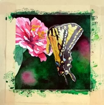
"Pink Sugar" - 5"x5"
So here is the finished version of my annual commission for my friend. I did a lot of work to develop the details of the butterfly, and, even though I loved the hard contrasts in the Zinnia's petals, I decided that I had to knock it back a bit so it wouldn't compete with the butterfly too much. So I think the brightly lit area at the top of the wings is the point of entry now, with lots of places to explore within the composition.

The other significant change was the pink blob toward the bottom. It kept getting in the way, I decided. To fulfill one of the "rules" listed in my previous post (little to no detail beyond the subject) it had to go. So the area was scrubbed and dark greens dropped in. I think that change helped things immensely.

And I'm happy to report that my friend was pleased with her painting!

Sunday, February 2, 2014

Butterfly commission


Each January I have a "commission" from a friend and co-worker. I put the word commission in quotation marks because she allows me to choose the subject of the painting, so I have freedom in this project that most commissions would not normally afford.

I keep her paintings within the parameters of floral subjects, with a couple of still life compositions thrown in. We counted up this year, and she now has six of my pieces, five of them being original paintings (one is a print because the original that she wanted had already sold by the time she saw it. Since then, I paint works just for her each January to ensure that she gets the original).

***

I must give credit to my mother for the inspiration of this project. She grows many, many flowers around her house, through all seasons. She now has a nice camera that she's been using to capture the fleeting glory of her blooms.

In this case, a large Tiger Swallowtail had taken up residence among a group of pink Zinnias, and the butterfly had no intentions of leaving his post while mom snapped photographs. So she has several closeups of blooms with the butterfly hard at work extracting sweet gifts. I saw the images, and immediately thought of my commission project.


That said, I still had some lessons to learn from this project. I initially started out with another idea -- with an image that had multiple blooms and I liked the idea of using the blooms to lead the eye around the piece. However, this is a small painting (only 5x5), and once I got into it, I realized that there was more in the composition that the space could easily accommodate. So that painting was halted mid-stream, and I went back to the drawing board, literally.

I thought about the paintings that I see other accomplished floral painters create, and I decided there were essential elements to making these compositions work, particularly when the painting is quite small.

  1. Tight focus on a primary subject
  2. Little to no detail beyond the subject
  3. Extreme value contrasts
  4. Dramatic lighting

With these "rules" in mind, I settled on a new image, mostly because I liked the little shadows some petals cast on the petals below. I thought that, plus the glow of light through the butterfly's wing, added the "dramatic" element, as well as helped with the value contrasts. I then cropped tightly on the subject and ignored all the background elements.

At this point, the painting is close to finished, but I have work yet to do with the butterfly. Stay tuned for the final product!

Friday, December 10, 2010

Christmas 2010


I've prepared Christmas cards for this year, and I've modified my usual painting of a snowy barn -- and instead painted a snowy house.

This is the house that's been the subject of an ongoing project for many, many months. The house was the childhood home of my father, and it was destroyed in a fire around 30 years ago.

Dad has wanted me to paint it for years. The problem has been that there are no photographs of the house...only random slivers accidentally included in family snapshots.

So I've created this painting from a composite of images. I'm also now working on the larger painting of the house, which will be completed in time for Christmas. I'll post pictures of that project when I am closer to its completion.

In other news, one of my lunchtime paintings has been included in the "First Art Show" in Winchester, Va. The show is in its third year, and proceeds from the show go to support First Night Winchester -- an organization that plans family-oriented entertainment for New Year's Eve in Winchester. The exhibit is at the Shenandoah Arts Council on Loudoun Street.

Merry Christmas!

Monday, November 1, 2010

White Iris


It's taking me forever to complete the little lunchtime paintings, but sometimes they turn out to be worth the wait!

I really like this little painting because of the strong sense of light. Because the contrasts are so strong in some areas, I felt as though I didn't need to fuss with a lot of details to make this come together.

I really like this pared-down, simple-is-best result. I also enjoy the hints of colors that bounce around in some of the shadowed areas. Overall, I think the petals sing with energy and color.

Sunday, September 19, 2010

"Small Works, Great Art"

The "Small Works, Great Art" show is open now through Dec. 18 at Water Street Gallery in Petersburg, W.Va.

Small Works seems a better description than" miniatures" and it accurately sums up the breadth of pieces included in the exhibit.

Mary is also inviting visitors to the gallery to create their own "Small Work" of art. She's created an art station in the corner of the room with paper and some basic supplies.

So stop by and see some lovely pieces, and create your own masterwork to take home!

Water Street Gallery is located near the intersection of WV 55 and U.S. 220 at the stoplight downtown in Petersburg. Hours are 11 a.m. to 4 p.m. Thursday through Saturday. Call 257-4513 during gallery hours to learn more.

Sunday, September 12, 2010

Another tiny landscape

Here's another of the tiny landscapes that will be part of the Water Street Gallery show. When I last visited owner Mary VanMeter, we were doing an initial run at organizing the pieces by putting them on the floor of one of the gallery spaces and moving them around.

She's planning to clear a wall in the front room of the gallery for the small works and bunch them into groups and rows.

A range of subject matter will be in the show, including landscapes, florals, religious iconography and fishing flies.

I'll find out when the show opens shortly and pass that along.

I also know that she's planning an open house for one Saturday during the show which will offer visitors the chance to make their own small works.


Friday, August 27, 2010

Miniature show

My friend Mary VanMeter at Water Street Gallery in Petersburg, W.Va., is excited to be organizing a small exhibit of small paintings!

We've engaged in an ongoing, friendly debate over calling the paintings "miniatures."

Inevitably, it seems, we fall into calling them miniatures out of convenience and habit, but I've argued that, technically, I don't think a small painting necessarily equates a miniature painting. To me, a miniature is created when an artist consciously attempts to paint a realistic scene or object in as small a scale as possible.

Much of what I do in small scale isn't so much a matter of attempting to paint as small as possible, but as conveniently and quickly as possible (e.g. my lunchtime paintings).

So are my lunchtime paintings minis? I guess it's up to the viewers to decide?

What do you think? What is the definition of a miniature, and is size the determining factor?

At right is one of the small-scale paintings I did for the show, which will open in October. I'll pass along details when Mary gets everything arranged. The size of the painting is 2 inches by 4 inches, and it's matted in a 4x6 frame. It's one of four little scenes that I completed, which, as a set, complete a larger landscape. So I guess it's part one of a "tetraptych."

The image is a little blurry because I forgot to photograph it before framing. So I shot through the glass with a polarizing lens to neutralize reflections. Sorry!

Monday, August 23, 2010

Finally calling this one finished


After three months (most of which was time spent in my tote) I declare this little iris to be finished (thank goodness). Already sketching out the next one to occupy me during lunch breaks.

After the horrible middle patch where I thought I had lost the painting, I think I recovered fairly well. Unfortunately, the compositional elements which interested me were lost with the failed background. But that's okay. Try, try again.

Tuesday, August 10, 2010

Saved by scrubbing


Well, I kept working on the background, resorting to some light scrubbing in places, and finally brought it into harmony with the iris. In the areas where I scrubbed, I went back in while the paper was still wet with Thalo Green and some yellow to brighten things. I think the roughened areas now add some texture as well, which helps add interest.

So now I'm down to working on the stem, the beards, and the veining. Boy, this one has been a struggle, but I'm nearly there.

Tuesday, August 3, 2010

Big change


Well, with the obvious failure of my original background, I got out the darks (Thalo Green and Permanent Rose) and resorted to one of my usual background techniques.

However, because this was an impulse substitution, I find that the iris no longer fits with its surroundings ... mostly because of its color. It's too pink, or something, and the areas where I had continued to darken the iris falls now don't work very well because they are disappearing into the dark background. I need more highlights and contrasts.

It's amazing how my natural tendency to work all over a painting helps avoid these kinds of errors. By naturally balancing tone and value in a comprehensive manner, paintings work better. My unplanned and sudden amendments have thrown this painting into limbo.

Friday, July 30, 2010

Background blues


Well, it was around this point that I decided I just wasn't happy with how the background was turning out. In my highly manipulated photo reference, I really liked this idea, but in the painting, I found that it was highly distracting.

I kept trying to darken the iris falls to to move the eye back to the foreground, but, as you can see it's just not working. I think this was a faulty concept. Sometimes I have to remind myself that keeping things simple is often the best design framework.

Wednesday, July 28, 2010

Lunchtime painting lingers


Oh, the dog days of summer, when everything moves so slowly.....

This lunchtime painting certainly falls into that pattern. I've been carrying it around with me since May, I think, and it's still not finished. Someday, I keep saying.

This is a little larger than the other minis have been. It's about 5 inches square, and I heavily modified the source photo in Photoshop to create the effect I wanted . . . sharp foreground with a particularly washed out background, but with some supporting diagonal lines to hold the composition in place (the diagonals are some background stems and the shadows from the siding on my house).

I really liked the tension the background created. I also like the slanted angle and the offset focal point.


I applied most of my preliminary washes very wet-into-wet to achieve the soft, out of focus effect for the background. I'll continue to glaze in the iris to build up its definition.


Saturday, April 3, 2010

Life lesson


Given the sadness that has permeated the last two weeks, I look at this little painting and try to draw some comparisons to life.

My conclusion: It's not the ending that matters so much as the journey. Enjoy the journey and learn from it as best you can.

Thursday, March 18, 2010

"Yeller" old


I'm almost there. . .

Close to wrapping this up now, but the process been slowed by the lovely weather during the last few days. It's been difficult to stay inside during lunch to work on the mini. So I've taken a few walks this week rather than paint.

The next mini, I've already decided, will move back to a point of comfort: a purple iris. The challenge will be its composition. I'm planning a square, which is always tricky to imbue with energy. Plus, I'd like to see if I can loosen up in such a small painting.

Tuesday, March 16, 2010

Baby steps


Well, I think it's looking better. The contrast of the rust/maroon elements on the falls helps immensely, I think.

Looking back over my color chart from the weekend, it appears that the most attractive mixes come from using Yellow Ochre. Those samples actually exhibit some almost silvery effects. Most of the others tend toward brown or green.

But I'm loath to use Yellow Ochre in most of my paintings because it is somewhat opaque, and it exhibited "milky" and dull attributes the few times I've tried it. Perhaps I was using it with incompatible pigments, so with some more experiments I might give it a second look.

Saturday, March 13, 2010

All about yellow . . .

I'd like to take some time to talk about yellows, since they are giving me so much trouble in this new mini.

By the way, here's the next stage of the iris:


Some progress, but it's still been very frustrating to create shadowed areas without turning them into mud.

So I decided I had to do some research. It's too late for this one, but I might be able to learn something for a new attempt.

So, out with the color wheel to discuss some color theory.


On the color wheel, colors that are opposite are complements, and when they are mixed, they neutralize one another, creating, in theory, a gray.

I use this principle all the time in my snowy barns series by mixing French Ultramarine Blue with Burnt Sienna. Those complements, representing blue and orange, create wonderful neutral tints. I can create a rich gray, or shift the balance to make the gray warmer or cooler.

In theory, as can be seen on the color wheel above, purple and yellow are complements. So, they should also be able to create a range of "grays," or neutral tints.

But, it's not that simple, it seems.


Somehow I'm pleased to see that, even on the color wheel, the window showing a mix of purple and yellow (circled in the image above) creates a muddy brown.

Yuck!

Muddy browns are not I'm after in creating the shadows in the iris' standards and falls, But that's what I keep running into as I work through the mini.

First, here's a rundown of some of the available yellows I have. These are all Winsor & Newton Professional Water Colours.

The range runs from cooler colors such as Winsor Lemon, to the warmer Quinacridone Gold. (Note on Quin. Gold -- this is W&N's new formulation which uses several pigments to mimic the appearance of the original one-pigment paint using PO 49. The one-pigment formula was discontinued in 2005, according to Bruce McEvoy's Handprint site.)

There are also two more opaque yellows in this mix, Cad. Yellow and Yellow Ochre.

The yellows I actually have used in the iris are Aureolin and Quin. Gold.

The pigments I've used within those two yellows to create shape and depth are two mixed purples (from the other irises) made from French Ultramarine Blue (PB 29) and Perm. Alizarin Crimson (PR 206). One purple is mixed with more blue, the other with more red. I've also used touches of Pthalo Green (PG 36) and Perylene Maroon (PR 179) as reflected colors within some of the shapes.

Now, if I create a color-mix swatch using all of these options, will I find that some mixtures are more successful than others?

Doesn't look promising. To the two mixed purples, I also included Ultramarine Violet. (To see the chart more clearly, you may have to click the image to see it full size.)

But, I'm going to use this chart for a future iris to help in planning. I hope that will lead to a better result.

In the meantime, stay tuned to see if I can rescue this mini . . .

Thursday, March 11, 2010

Yellow with fear


Well, I've started a new Lunchtime Painting, and I've listened to the challenge of a friend who told me I should try an iris in a different color.

Well, here it is, and boy it's been difficult.

I have never attempted to mix much with yellows before, and creating neutral tints for the shadows, etc., has been problematic.

Lesson learned: You can make some really sickly colored tints with yellow if you don't know what you are doing.

Sunday, March 7, 2010

A happy ending


It was a happy ending for me, at any rate. Very pleased with this one, and I enjoyed having such a detailed record of the process so much that I finally worked out how to create an Adobe Flash slideshow just for the occasion.

If you visit my Web site, www.waitesrunstudios.com, I've created a new entry page that features the Flash movie, with each stage of this painting softly melting into the next. I find myself watching the movie for long periods of time. I'll focus on some particular section, a portion of a fall, for example, and watch how that little section changes. Then I'll move to another small area and repeat. It's hypnotic.

Thanks to my friend Roger, I also might have a name for these minis that I complete while on my lunch hour. "Lunchtime Paintings," was his off-hand suggestion. I rather like the sound of that, but I wonder if anyone else has some ideas. Speak up, if you do.

I want to keep working on little projects during lunch (and have already started another iris). When the weather improves, I'd also like to wander downtown and do some plein air sketches from time to time.

The end result feels greater than this little painting. I feel enthusiastic about painting, for the first time in months, and keep thinking of ideas and experiments that merit further exploration.

Lastly, thank you, Eleanor, for your kind words about the penultimate stage of this mini. I hope the end result doesn't disappoint?

Friday, March 5, 2010

Wait for it!


Okay, sorry for the unoriginal misuse of the classic Monty Python line in the title. But, just as a tease, let me say that I'm REALLY happy with how this mini wrapped up. Yes, I'm working one image ahead of the blog, but let me encourage you to check out the next post to see the final image.

However, back to the image in this post . . . I continued to glaze into the darkest areas to highlight contrasts and create depth in the form.

At this point, most of the formative glazes are finished. What remains is the critical addition of veins into the standards and falls, and from the several irises I've painted over the last few years, that final step is what really determines the realism in the flower.

So, stay tuned!

Thursday, March 4, 2010

Pleased so far


So far, this mini feels successful. I think I have better contrast in the standards and falls, and I think the shape feels much more dynamic. I like how the positive and negative space interact. Essentially, it's a diamond in a rectangle.

It might be a little too centered, but I don't think it feels static. The structural shapes within the iris provide movement.