Showing posts with label composition. Show all posts

Tuesday, February 17, 2015

Sunstruck

"Sunstruck" - 5"x8"
I took a detour and spent time on this sunflower for a few weeks. Given how cold it's been, I think it warms me up by simply looking at it.

I developed this composition and its feeling of bright sunshine by following some of the "rules" I listed last year for doing small floral paintings (see the original post here).


  • Tight focus on a primary subject
  • Little to no detail beyond the subject
  • Extreme value contrasts
  • Dramatic lighting


I think the leaves and stem fall under the "little to no detail beyond the subject" rule. The point is the flower (and maybe the bee), but not the plant. So merely suggesting the greens is sufficient. There's no need to get fussy over them.

Now, about that bee.....in my original drawing, the bee was the focal point. But in the painting, the extreme value contrasts on the lower petals really hog the scene. I had already blocked the bee shape in when I realized that I might have a problem. I thought about scrubbing the bee out, but I decided to leave it. I'm hoping it encourages the viewer's gaze to move around all the petals, rather than focusing on just the brightest ones.

I used six pigments: Lemon Yellow, Cad Yellow and Quin Gold, as well as Permanent Rose, Pthalo Blue (GS) and Quin Burnt Orange.

Wednesday, February 5, 2014

Pink Sugar

"Pink Sugar" - 5"x5"
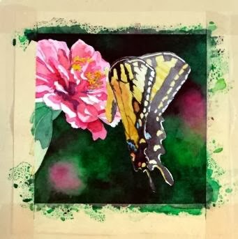
So here is the finished version of my annual commission for my friend. I did a lot of work to develop the details of the butterfly, and, even though I loved the hard contrasts in the Zinnia's petals, I decided that I had to knock it back a bit so it wouldn't compete with the butterfly too much. So I think the brightly lit area at the top of the wings is the point of entry now, with lots of places to explore within the composition.

The other significant change was the pink blob toward the bottom. It kept getting in the way, I decided. To fulfill one of the "rules" listed in my previous post (little to no detail beyond the subject) it had to go. So the area was scrubbed and dark greens dropped in. I think that change helped things immensely.

And I'm happy to report that my friend was pleased with her painting!

Sunday, February 2, 2014

Butterfly commission


Each January I have a "commission" from a friend and co-worker. I put the word commission in quotation marks because she allows me to choose the subject of the painting, so I have freedom in this project that most commissions would not normally afford.

I keep her paintings within the parameters of floral subjects, with a couple of still life compositions thrown in. We counted up this year, and she now has six of my pieces, five of them being original paintings (one is a print because the original that she wanted had already sold by the time she saw it. Since then, I paint works just for her each January to ensure that she gets the original).

***

I must give credit to my mother for the inspiration of this project. She grows many, many flowers around her house, through all seasons. She now has a nice camera that she's been using to capture the fleeting glory of her blooms.

In this case, a large Tiger Swallowtail had taken up residence among a group of pink Zinnias, and the butterfly had no intentions of leaving his post while mom snapped photographs. So she has several closeups of blooms with the butterfly hard at work extracting sweet gifts. I saw the images, and immediately thought of my commission project.


That said, I still had some lessons to learn from this project. I initially started out with another idea -- with an image that had multiple blooms and I liked the idea of using the blooms to lead the eye around the piece. However, this is a small painting (only 5x5), and once I got into it, I realized that there was more in the composition that the space could easily accommodate. So that painting was halted mid-stream, and I went back to the drawing board, literally.

I thought about the paintings that I see other accomplished floral painters create, and I decided there were essential elements to making these compositions work, particularly when the painting is quite small.

  1. Tight focus on a primary subject
  2. Little to no detail beyond the subject
  3. Extreme value contrasts
  4. Dramatic lighting

With these "rules" in mind, I settled on a new image, mostly because I liked the little shadows some petals cast on the petals below. I thought that, plus the glow of light through the butterfly's wing, added the "dramatic" element, as well as helped with the value contrasts. I then cropped tightly on the subject and ignored all the background elements.

At this point, the painting is close to finished, but I have work yet to do with the butterfly. Stay tuned for the final product!

Wednesday, December 25, 2013

"Winter Whites"

"Winter Whites" - 12"x12"

Merry Christmas!

I am pleased with the painting that I used for my Christmas cards this year. Normally I use a tiny little painting that's no larger than the image size that ends up on my 5x7 cards. This year, I tried something very different, and painted a large painting, 12x12.

I also used some different techniques - namely in reserving some of the whites. I have done a very limited experiment in the past with white crayons to reserve an area of whites, and I don't think it worked very well because of the opaque nature of the white crayon.

This time, I got a pack of clear wax crayons specifically designed for use with artists' materials, and that's what's reserving most of the white areas of the snow-covered foliage on the embankment above the roadway. There's a bit of that treatment in the background trees above the house as well.

Most of the foreground snowbank is made of areas that I painted around with a large brush, as is the snow-covered roof of the house. In fact, I used no masking fluid anywhere on this painting, which is a first for any of my snowy scenes.

Other lighter areas were created by dropping water into fresh paint, which created lovely blossom effects (good for lacy bits of vegetation). I really wanted a loose feel with this painting, and I think I managed that. I really feel that I am fussing far too much on some paintings, and it's sapping vitality from the final product.

I felt reinforced in that belief a few weeks ago after seeing the new Van Gogh exhibition at the Phillips Collection in Washington D.C. called "Repetitions," which examines Van Gogh paintings where he completed the same composition multiple times. Generally, I always felt that I preferred the earliest versions of these series because they seemed fresher and more energetic.

I'm also pleased that multiple people have correctly recognized the location of this painting, even though I have changed elements to improve the composition. That indicates that I've got the essence of the scene, with minimal hand-wringing. I'll call that a success!

Monday, October 21, 2013

Solitude

"Solitude" - 8x8

So after many hesitant revisions, this little painting joins the ranks of the Wardensville series.

In many ways, this project may be the closest I've come to following Bill Vrscak's advice: (see my earlier blog post on Bill Vrscak) ..."the best compositions are developed via sketching and simplification -- to [Vrscak] a painting should not be an exact copy of a scene or subject because that's what photography is for. Instead, painters must remember that what is on the surface of the paper is far more important than what the painter is seeing."

Well, given the quality of my source photograph, sketching and simplification were my only options.


I took the photo with my cell phone while on a morning walk. I don't know what attracted me to the scene, given all the obstacles between me and the focal point. But I know that I often see "glimmers" of paintings as I walk and/or drive around. If I pause and look more closely, the vision seems to vanish. So I'm beginning to trust my instincts, snap a photo, and ask questions later.

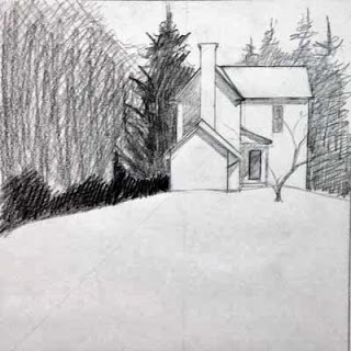
So here was my first simple sketch of the scene:

First sketch
It's very rough, but what I liked was the contrast between the background foliage shapes and the hard white geometry of the house.

Working to refine the shape of the house, I then did this sketch. This drawing also determined the direction of the light and how the shadows were cast on the different sections on the house. Additionally, I moved the house "up" on the hill.

Second sketch
A couple of watercolor value paintings were next, which I had posted in an earlier blog entry:

Value #1
Value #2
The purpose of these little paintings was to figure out how I wanted to break up the mass of foliage that surrounds the house. I knew the contrast between the large pine to the left and the house was critical, but I wanted to play with other values around those key elements.

Now it was time to paint...


In this early stage, I tried, per Bill Vrscak's advice, to block in big shapes first. I also  tried to make the outlines of those shapes interesting, and to vary the colors within the shapes so they wouldn't be flat and boring. Since the light was hitting from the right, I used more yellows to that side, and added cooler blues as I worked to the left.

From the value paintings, I had decided to not worry about any details in the foliage, and to push it all to the background. However, when looking at the painting at this point, I began to feel that it was too simple and too boring. So I stopped working on it for quite a while, and kept thinking about it. Finally I decided that I had to lift some of the wash to the left side, and develop some sense of hanging foliage that would add depth to the foreground elements. So the next stage shows that mass of foreground foliage as it starts to develop.

Along the way, you may have noticed that I eliminated the little tree that had been growing in front of the house. I had the tree in my pencil sketches, but in distilling the lessons of those early sketches, I decided that it was the shape of the house against the dark background that drew my interest. That contrast seemed dramatic, perhaps even mysterious. Obscuring that stark contrast with the mid-ground tree seemed superfluous, so I eliminated the tree from the design.

At this stage, I had also worked to break up the foliage areas surrounding the house, and developed the foreground to add texture and interest to what otherwise could be a large boring shape.

To finish up, I strengthened the cast shadows in the house, and added some very slight touches of detail. I didn't want to fuss over the house, and I think I kept it fairly simply, yet it reads in a realistic manner.
"Solitude" - 8x8

Monday, September 2, 2013

Value studies


I am working from a really poor photo reference, so I'm essentially making this scene up. So that should make for a good painting...if I had the skill set of Bill Vrscak. But I'm certainly not there yet, so this challenge worries me.

So, I've resorted to doing some little value paintings to try to figure out how I want to develop all the foliage around the structure. Here are two of the options.

I guess it's time to scale things up to full size...

Sunday, June 16, 2013

Bill Vrscak workshop in Morgantown


Photo by D. Byron Witt and used with permission.
Bill Vrscak (left) talks to participants at the
Morgantown Art Association's spring workshop in April 2013.

Photo sourced from Morgantown Art Association's Facebook page:
https://www.facebook.com/pages/Morgantown-Art-Association/304517989577522


I'm going to try to encapsulate my experience at the Bill Vrscak workshop in early April, hosted by the Morgantown Art Association (www.morgantownartassociation.com). Bill is a painter and graphic artist from the Pittsburgh area, and I've known about his watercolors for quite some time. (You can see examples at his website http://www.billvrscak.com/) So it was with great excitement that I learned that MAA was organizing a four-day watercolor workshop with him.

Bill demonstrated each morning, and then we turned to our own boards and attempted to nail his ideas and techniques down with brush and paper. At times I would vaguely feel that I was "getting it" and at other times I flat out didn't, but I never felt extremely frustrated. I could see such value in his ideas and suggestions that I wanted to absorb everything to the fullest extent possible.

I would like to share a detailed record of the workshop, but there is so much that I learned over the course of the four days that I don't know if I can really do justice to the full experience. But I will try.

I'll synthesize Vrscak's philosophy, as I understood it, into one short sentence: The best watercolors do more with less.

That one statement applies to nearly every stage of an individual painting's development. I will try to explain that central idea in a step-by-step way.

Here is one of Bill Vrscak's sketches as he begins to develop a painting.
SKETCHING: For Vrscak, the best compositions are developed via sketching and simplification -- to him a painting should not be an exact copy of a scene or subject because that's what photography is for. Instead, painters must remember that what is on the surface of the paper is far more important than what the painter is seeing.

So, Vrscak  pares down the subject matter and looks for what he finds vital. And one area in the composition should be of greatest importance -- this is the point of entry for a viewer  and everything else is secondary. Sketching helps a painter develop that entry point and then simplify the rest of the scene. As you can see in the photograph of one of his sketches (shown above), there's nothing elaborate about the sketch. It's a road map of sorts -- the relative shapes of the masses have been worked out, there's a hierarchy of dark and light values, and the overall composition within the frame has been established.

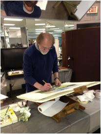
A painting in progress, reflected in the overhead mirror.
Here you can see Vrscak's limited palette.
THE PALETTE: Next, Vrscak only uses six colors on his palette - a split primary palette composed of a warm and cool version of Yellow, Red and Blue. The colors he used in our workshop, listing the cool version in each pair first followed by the warm version, were Aureolin and Cad Yellow, Permanent Alizarin Crimson and Cad Red, and Winsor Blue (Green Shade), and Ultramarine Blue.

He said he will mix those up from time to time, substituting Cobalt Blue for Ultramarine, for instance, and maybe he will add some specific color to the palette, such as a earth color, for a particular subject. But for the most part, his large, white palette had mostly empty wells. He said he went to this limited palette some time ago because he wanted to simplify his color mixes and concentrate more on values. The limited palette also makes it easier for him to replicate color mixes, and after years of using it, he knows exactly what ratios of which colors will produce what he needs at a given time with minimal fuss.

Photo by D. Byron Witt and used with permission.
Bill Vrscak
Photo sourced from Morgantown Art Association's Facebook page:
https://www.facebook.com/pages/Morgantown-Art-Association/304517989577522
THE BRUSHES: Vrscak says he likes flats, and he specifically likes flats with extra long bristles. Often marketed as "one stroke" brushes, I found these brushes to be a revelation. I've always liked the look of paintings that obviously were created using flats -- but when I have tried to use flat wash brushes, they have always felt too stiff and seemed to pull off as much pigment as I was trying to put down. I have a massive collection of flat brushes that I have purchased and then set aside because I did not like how they felt.

However, these "one stroke" versions have a much softer feel, more like a nice pointed round. Vrscak said he likes them because of the amount of pigment they can hold. The fewer times he has to go back into his palette to pick up pigment, the better. They also have nice spring and flexibility and can make great "marks." He uses the edges in smaller areas and tries to use as big a brush as he can for as long as he can. He warns that relying on only small brushes leads to excessive concern for the detailed areas, and a loss of vision of the painting as a whole.

In this demo painting by Bill Vrscak, broad washes went down first, followed by a limited number of detailed marks. An obvious entry point, nice value contrasts, interesting contours, and just the right amount of texture make this a wonderful example of a watercolor painting. I am very proud to say that I am now the owner of this painting!!!
THE PAINTING: As for the painting itself -- Vrscak works to establish the big areas first with broad washes applied with big brushes, and he gets most of the white of the paper covered quickly, because it helps him to make more accurate value judgements He also establishes a dark early in a painting's development for the same reason.

He slants his paper as a way of controlling washes and eliminating back runs, and he aways makes subtle changes in the color mixes of the large washes. A good example of this is in the photo above with the distant mountain to the right. A slighter pinker color grades into a greyish green to the right, with a touch of a greyish purple at the base. It's simple, yet so effective. Many more slight color shifts can be seen in the large foreground area. These touches help keep large washes from becoming boring and flat, yet they are subtle and don't distract from the focal point. The overall effect is a feast for the eyes.

Vrscak's goal with the really large areas is to get something down on the first application, make it look interesting, and not go back into it. And that's the secret of "fresh" watercolors. Don't mess with it!

As the painting moves along, smaller brushes are used to develop the important bits of the painting, but only those most important parts get special treatment and more work. Vrscak reiterates that getting too concerned with all the details all over a painting means that you have lost the focus of the painting.

Here is another demo painting by Bill Vrscak from the Morgantown workshop. This painting still has more development in store, but you can see just how much can be accomplished with the skillful application of large value masses.
FINALLY: More good advice from Vrscak: Make interesting washes, interesting shapes and interesting contours. Accept that a watercolor is a simply a collection of flat shapes and marks and that they must relate to one another for a painting to be successful. So arrange the marks in a pleasing way and keep it simple!

This really was a wonderful workshop for me, and it came at the right time in my development as an artist. I'm beginning to get a sense of what I'm good at doing, and I really enjoy playing with and controlling compositional elements now, so much of what Bill Vrscak offered us in the way of advice and ideas was exceptionally helpful to me. I absolutely would attend another of his workshops and would encourage any watercolorist at any level to take from him as well. He is a great teacher as well as being a great painter, and that is a combination that I really admire.


Sunday, April 21, 2013

Alley


Here is an in-progress shot of another painting in the Wardensville series...I'm trying out some ideas from the recent Bill Vrscak workshop I took at the Morgantown Art Association. You can see some of Bill's wonderful paintings at his website www.billvrscak.com.

Bill uses a split primary palette - warm and cool versions of yellow, blue and red. He also stresses the use of value sketching to develop compositions, and believes that the best paintings come from the worst references -- the more the artist has to create to make a composition work, the better. Otherwise, he wonders, why go through the effort of painting a scene from a beautiful photograph? The photographer has already done the work and there's little that the artist can add to the scene.

I filled up a small notebook as he talked and worked on demo paintings -- he shared so many wonderful ideas with the group. I need to sit down and retype everything to help me digest all of the useful information.

There is good news regarding the entire Wardensville series that I'd like to share. I'm going to have a small showing of the paintings at the Wardensville High School alumni dinner this fall. I thought it would be a good venue with folks who know the town intimately. I hope the group will enjoy my efforts to bring life to the scenes we often overlook.

There's another announcement regarding the alumni dinner that I'd like to make, but I think it deserves its own post...stay tuned!

Saturday, October 20, 2012

"Red Shed"


"Red Shed"
8"x8"
Well, the first one is finished...I don't know that it turned out quite the way I had originally imagined it, but it will have to do. Somehow, my sketch has more balance and energy...too much concern with painting clean, straight lines has diminished those positive attributes.

Once I had finished the painting, I went back and looked at my sketch and realized that one possible problem was the background foliage. In my sketch, I had broken the mass of trees into two parts, with the corner of the background structure jutting out against the flat sky.

In the little study, and in the final painting, the foliage area had grown and now rounded that corner behind the building.

Thinking that perhaps this chance was affecting the balance of the elements, I scanned the painting and then Photoshopped the sky back into the scan. Somehow that change made me feel better, so I decided to take the risk and do the same in the painting.

I carefully masked the shape of the building with masking tape, then scrubbed out the foliage in area that concerned me. I tried to go light on the pressure, to lessen the damage to the surface of the paper.

Once that was done, I removed the masking tape, and carefully flushed more Cobalt Blue into the area to match up with the rest of the sky. The top painting is the result. The bottom is what it looked like before I made that last change.

I'm not sure that it really helped matters. I think the geometric arrangement of the overlapping structures is more dominant in the final version, but you could also argue that the foliage shape helped to soften those hard edges and balanced the two corners (lower left and upper right). I'm not sure. Based on the pencil sketch, I had really liked the arrangement, and I wanted to stay as close to that model as I could.