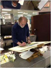
It's been a tremendously long time since I've posted anything. Unfortunately, I'm still not painting in a serious way, but I've tried to dabble in a couple of new things to try and restart my creative life.
Yesterday, I took a plein air class at the Museum of the Shenandoah Valley in Winchester, Va., taught by a local art teacher, Cindy Redmon.
I've not really done plein air before (I did a plein air demo of sorts years ago at the local craft co-op, where I mucked around tremendously), and certainly not painted in a group setting for a while.
The other spin on this class was that the medium was acrylic, which I have no experience with.
Add in the triple-digit heat index in the Shenandoah Valley, and it certainly looked like it would be a very long day.
+++
However, it ended up being a very enjoyable experience. The gardens at MSV, which are part of the Glen Burnie estate, are magnificent. The class coordinator, Courtney, was great at taking care of our needs (and providing lots of water). And Cindy did a great job leading the class.
The sketch I've posted here is of the statue at the end of the Pleached Allée. I completely lost the light as I moved down the figure, so it doesn't make a lot of sense, but I did move quickly enough to get the light set on her face. I think that's the biggest challenge of plein air....the sun moves so quickly that the scene completely changes in no time.
The acrylic was really frustrating for me at the onset, and still was frustrating by the end of the day (the value shift as it dries is maddening), but it was oddly fun to make a different kind of mess. I'm not switching to acrylic, but I think I would like to play with an opaque medium a bit more.
If you are traveling through the Valley, take time to visit MSV and see the gardens. Learn more at https://www.themsv.org/
Showing posts with label workshop. Show all posts
Sunday, July 24, 2016
Wednesday, September 11, 2013
Pittsburgh Society of Illustrators
Anni Matsick, the newsletter editor for the Pittsburgh Society of Illustrators, included a blurb about my Bill Vrscak workshop blog post in the July issue of the society's newsletter and included a photo from Morgantown Art Association member Byron Witt.
Bill Vrscak is also a member of PSI. You can read my account of his workshop at http://waitesrunstudios.blogspot.com/2013/06/bill-vrscak-workshop-in-morgantown.html
Visit http://www.pittsburghillustrators.org/ to see the entire PSI July newsletter in pdf format and to learn more about this great organization and its many talented members. Be sure to check out the website of Anni Matsick as well: http://annimatsick.com/
Sunday, June 16, 2013
Bill Vrscak workshop in Morgantown
![]() | |
Photo by D. Byron Witt and used with permission.
Bill Vrscak (left) talks to participants at the Morgantown Art Association's spring workshop in April 2013. Photo sourced from Morgantown Art Association's Facebook page: https://www.facebook.com/pages/Morgantown-Art-Association/304517989577522 |
Bill demonstrated each morning, and then we turned to our own boards and attempted to nail his ideas and techniques down with brush and paper. At times I would vaguely feel that I was "getting it" and at other times I flat out didn't, but I never felt extremely frustrated. I could see such value in his ideas and suggestions that I wanted to absorb everything to the fullest extent possible.
I would like to share a detailed record of the workshop, but there is so much that I learned over the course of the four days that I don't know if I can really do justice to the full experience. But I will try.
I'll synthesize Vrscak's philosophy, as I understood it, into one short sentence: The best watercolors do more with less.
That one statement applies to nearly every stage of an individual painting's development. I will try to explain that central idea in a step-by-step way.
![]() |
| Here is one of Bill Vrscak's sketches as he begins to develop a painting. |
So, Vrscak pares down the subject matter and looks for what he finds vital. And one area in the composition should be of greatest importance -- this is the point of entry for a viewer and everything else is secondary. Sketching helps a painter develop that entry point and then simplify the rest of the scene. As you can see in the photograph of one of his sketches (shown above), there's nothing elaborate about the sketch. It's a road map of sorts -- the relative shapes of the masses have been worked out, there's a hierarchy of dark and light values, and the overall composition within the frame has been established.
![]() |
| A painting in progress, reflected in the overhead mirror. Here you can see Vrscak's limited palette. |
He said he will mix those up from time to time, substituting Cobalt Blue for Ultramarine, for instance, and maybe he will add some specific color to the palette, such as a earth color, for a particular subject. But for the most part, his large, white palette had mostly empty wells. He said he went to this limited palette some time ago because he wanted to simplify his color mixes and concentrate more on values. The limited palette also makes it easier for him to replicate color mixes, and after years of using it, he knows exactly what ratios of which colors will produce what he needs at a given time with minimal fuss.
![]() |
| Photo by D. Byron Witt and used with permission. Bill Vrscak Photo sourced from Morgantown Art Association's Facebook page: https://www.facebook.com/pages/Morgantown-Art-Association/304517989577522 |
However, these "one stroke" versions have a much softer feel, more like a nice pointed round. Vrscak said he likes them because of the amount of pigment they can hold. The fewer times he has to go back into his palette to pick up pigment, the better. They also have nice spring and flexibility and can make great "marks." He uses the edges in smaller areas and tries to use as big a brush as he can for as long as he can. He warns that relying on only small brushes leads to excessive concern for the detailed areas, and a loss of vision of the painting as a whole.
He slants his paper as a way of controlling washes and eliminating back runs, and he aways makes subtle changes in the color mixes of the large washes. A good example of this is in the photo above with the distant mountain to the right. A slighter pinker color grades into a greyish green to the right, with a touch of a greyish purple at the base. It's simple, yet so effective. Many more slight color shifts can be seen in the large foreground area. These touches help keep large washes from becoming boring and flat, yet they are subtle and don't distract from the focal point. The overall effect is a feast for the eyes.
Vrscak's goal with the really large areas is to get something down on the first application, make it look interesting, and not go back into it. And that's the secret of "fresh" watercolors. Don't mess with it!
As the painting moves along, smaller brushes are used to develop the important bits of the painting, but only those most important parts get special treatment and more work. Vrscak reiterates that getting too concerned with all the details all over a painting means that you have lost the focus of the painting.
This really was a wonderful workshop for me, and it came at the right time in my development as an artist. I'm beginning to get a sense of what I'm good at doing, and I really enjoy playing with and controlling compositional elements now, so much of what Bill Vrscak offered us in the way of advice and ideas was exceptionally helpful to me. I absolutely would attend another of his workshops and would encourage any watercolorist at any level to take from him as well. He is a great teacher as well as being a great painter, and that is a combination that I really admire.
Sunday, July 29, 2012
Bright Eyes
Here is another of the class exercises from Jane Paul Angelhart's class. I did most of this while the workshop was going on, with a few extra touches done since. I think I need to get a background started before doing much more with this little girl's face. It's hard to gauge the shadows and cast shadows against the plain white background.
Sunday, June 5, 2011
Portrait workshop project
I've been playing with a project from an April workshop that I wanted to share. Jane Paul Angelhart returned to the Shenandoah Valley in April and conducted a workshop for VECCA.
Jane had prepared three portrait projects for us to work on through the three-day workshop. Since I'm so meticulous on these portraits, especially at the beginning, I didn't come close to finishing the first two projects, and I missed the third day altogether because of work commitments.
However, weeks later, I've finally finished the little girl from the first day of the workshop, and I thought I'd share some images of my progress.
For her class participants, Jane provides reference photos and a 7x10 piece of watercolor paper with several critical outlines pre-drawn. Those are the red marks you can see on the first image above. (I'm posting these images larger than I normally would because they are class exercises.)
This first image is my favorite because I love the hints of color on beautiful, clean paper. There's something so fresh about an image at this stage.
As you can see in this version, I've skipped quite a few steps, but mostly the changes involve building up the skin tones of her face by using washes of Daniel Smith's Quin Coral, Perinone Orange, Quin Gold, and MaimerBlu's Sap Green. I also used gentle scrubber brushes to soften and alter the line of the highlight along her forehead.
I cannot stress enough how much I have learned from taking two workshops from Jane Paul Angelhart. She is an extraordinary teacher, who provides the right kind of guidance from the onset. I never thought I could paint portraits because my early attempts at mixing skin tones were always disastrous. But Jane's palette, and her enthusiastic demonstrations and advice make all the difference.
Jane had prepared three portrait projects for us to work on through the three-day workshop. Since I'm so meticulous on these portraits, especially at the beginning, I didn't come close to finishing the first two projects, and I missed the third day altogether because of work commitments.
However, weeks later, I've finally finished the little girl from the first day of the workshop, and I thought I'd share some images of my progress.
For her class participants, Jane provides reference photos and a 7x10 piece of watercolor paper with several critical outlines pre-drawn. Those are the red marks you can see on the first image above. (I'm posting these images larger than I normally would because they are class exercises.)
This first image is my favorite because I love the hints of color on beautiful, clean paper. There's something so fresh about an image at this stage.
As you can see in this version, I've skipped quite a few steps, but mostly the changes involve building up the skin tones of her face by using washes of Daniel Smith's Quin Coral, Perinone Orange, Quin Gold, and MaimerBlu's Sap Green. I also used gentle scrubber brushes to soften and alter the line of the highlight along her forehead.
Finally, here is the finished version, which includes several more washes along the background, additional washes on her shirt, refinement of the shape and shadows of the ear, and some more touches of wispy hair. I didn't want to fuss too much with secondary areas such as the ear, because that's not the focus of the image. Her eyes, as well as the shape of that beautiful highlight, should be the dominant element.
Wednesday, October 13, 2010
Jeannie McGuire workshop

I am finally getting around to a report on the Jeannie McGuire workshop hosted by the Morgantown Art Association on Oct. 2-3.
McGuire is steadily gaining attention in watercolor circles for her distinctive style and approach to painting. Most of her paintings include the figure, and her painting energies are devoted to incorporating those figures into spare and suggestive compositions.
One of my early impressions during the workshop was contrast. McGuire is a slender, petite woman, her voice is soft, and in the crowded workshop setting, it took a while for everyone to stop chatting and turn their attention to her.
However, McGuire carries a big brush, and she's not afraid to use it. Faced with a piece of pristine watercolor paper, I still feel weak in the knees. McGuire looks at the same paper and immediately slaps down some fat, dark washes just to show the paper who's boss.
Most of her work is completed with large flats, Robert Simmons White Sables, in 1-, 2-, and 3-inch widths. The large sizes are helpful when working on large-scale paintings, and she enjoys the sense of confidence necessary in using such large brushes.
As she demonstrated for the group, she explained that she doesn't have any set palette, other than her unorthodox use of titanium white. She is open to experimentation, and watching her paint is a little like watching a performance. She readily admits that she's not sure what's going to happen, but she intends to enjoy the journey.
That's the point where I had some difficult distilling the process McGuire utilizes. She is a very intuitive painter, and will change course in an instant if she creates a particular "mark" that she feels will advance the work and strengthen the composition.
So there's no step-by-step guide for painting like Jeannie McGuire. And that's a good thing, when you think about it. Because she moves so intuitively around her work, the end result is very much a personal statement about a moment and a mood.

Mark-making, as she she describes it, is important to her process, and the large flats assist in this style. Large swaths of color go down quickly, and then she steps back to reflect on the next step. There are no super-soft graduated blends and tentative, watery effects in McGuire's work. The end result, after multiple revisions, is painterly and energetic, captures movement and mood, and is carefully composed -- values and shapes lead the viewer over and around and through her figures' environments.
What I learned from the workshop was to let go, if only a little bit. I had brought some black and white reference photos that I had already cropped into compositions. I created drawings based on the photographs, transferred the drawings to my watercolor paper -- and then I panicked. It was the weak-in-the-knees moment, as usual.
The first day's painting was left incomplete, but I did try to carefully think about creating shapes and values in and around my figures that would help direct the viewer's gaze. I made bolder marks that I usually do, and I left that evening with a positive sense of what was possible.
The next day, on a separate project, I panicked again. This time I stared at the drawing on my paper for an hour, wandered around the room to see how others were progressing, and determined that I had no chance of being successful. When I finally put my first marks on the paper, I immediately did not like them, and knew I had ruined the painting.
Then I got a little angry. Since it was just a piece of paper, as I kept telling myself, I started slapping paint in a reckless sort of way, just to get through the afternoon. I was ready to crawl back into my watery glazes and overworked details, but I still had to ride out this workshop.
And an amazing thing happened. I looked down at the painting at some point, and nearly fell over. It was bold and realistic and exhibited movement and character. I had unwittingly gleaned something from McGuire's discussion and demonstrations, and had managed to paint outside myself for a while.
And I liked what I saw.
Where I go from here is uncertain. I have the ideas of some great painters percolating in my mind, and I don't know how to go about fitting these ideas into my "style." Honestly, I'm not sure that I even have a style.
But it's been an eye-opening year in many ways, and I am excited about what will develop as I continue painting.
Thank you to Jeannie McGuire for being such an inspiring teacher.
For more about McGuire's techniques, read the the August 2010 Watercolor Artist magazine, where she is featured by writer Christine Proskow. And to see more of McGuire's amazing work, visit her website at http://jeanniemcguire.com
Thursday, June 3, 2010
Angelhart workshop
Days and days after the close of the workshop, and I finally get around to talking about what a wonderful experience it was!
Jane Paul Angelhart, whose work can be seen at www.angelhart-portraits.com, led our 11-person class through a couple of demonstration portraits, stressing color mixing, glazing, and "mapping" -- what she terms the facial details you draw with your brush directly on the paper.
In essence, she explains, she goes about portraits in reverse. Most of the time, watercolorists are instructed to lay down large washes at the start, work from light to dark, and develop the details later in the work.
For portraits, however, Jane argues for going into the details at the onset, particularly in the areas of the eyes, nose and mouth. Her method, she believes, allows her to capture the subject's likeness at an early stage, giving her the confidence to apply those larger washes.
Her glazing techniques also use those initial detailed areas as "roadmaps." They don't disappear under a light skin-tone wash, so they help guide her through the development of the facial structure as she builds up layers of glowing colors.
Her palette is also a point she stresses. Most of the colors are from Daniel Smith, and nearly all are transparent. As Jane puts it, muddy colors make mud. (Her website includes a link to her complete palette if you'd like to learn more. Look under the "DVD" link and click on her palette at the bottom of that page.)
I didn't get all the the pigments prior to the class, but I got the basics, and Jane was more than willing to share a squirt of her paints to help us see how she achieves such glowing colors. I've already built a wish list to pick up some more of the paints sometime soon.
Here's an example of one of the structured demos Jane provided:


These small works (about 7x10 inches) are not in perfect sequence because they are live demo pieces Jane works on during her classes, but they show that progression of mapping features first, then adding some darks to help gauge values.
Jane also advocates for mixing colors on the paper rather than on the palette, laying pigments next to one another and letting them blend. Controlling the amount of water in the brush matters immensely in this sort of paint application, so she regularly blots her brush with a terrycloth towel to avoid unexpected backruns, etc.
Jane also cautions that too many blues and purples applied too early can deaden skin tones. She applies bright reds and oranges, along with greens as a neutral tone, and only later goes into the cool blues and purples.
The avoidance of blues and purples was the issue that hampered me most. I so badly wanted to dive into some cobalt blue when perplexed by a shadow area. But, as you can see above, Jane has depicted beautiful shadows and highlights across the young girl's face without resorting to those kind of color choices.

Here, several class participants look over our versions of Jane's demo. For a group generally inexperienced with portraiture, we had many positive outcomes with this demo! Click on the photo to see a larger version of the image. My version is to the far right, sans hair and background.

Here's a closer view of where I got on this demo. I was being very meticulous on layering light washes of color to achieve the right effect, so I didn't make a lot of progress.
The last day of the workshop, Jane encouraged us to bring in our own materials -- whether a failed painting from the past, a photograph, etc. I decided I would try my Kadie portrait again.
You may remember Kadie. I completed her early in 2009, and she was my first attempt at a portrait. I was very proud of her at the time, but now I'm not so happy with her given all the new ideas I have on glazing, shadow colors, etc. (To see my work-in-progress discussions of Kadie, search for the "Kadie"blog post label in the list to the left.)
Kadie 2.0 is nearly half finished. I'll post images of her progress soon.

And here is Jane Paul Angelhart! At the end of a busy last day, Jane went over the displayed works with everyone (mine is behind her head -- look for the bright green sunglasses). She encouraged everyone to keep painting, and also encouraged us to stay in touch with one another.
As I said, it was a wonderful workshop, and I am so grateful to have had the opportunity to meet Jane.
Jane Paul Angelhart, whose work can be seen at www.angelhart-portraits.com, led our 11-person class through a couple of demonstration portraits, stressing color mixing, glazing, and "mapping" -- what she terms the facial details you draw with your brush directly on the paper.
In essence, she explains, she goes about portraits in reverse. Most of the time, watercolorists are instructed to lay down large washes at the start, work from light to dark, and develop the details later in the work.
For portraits, however, Jane argues for going into the details at the onset, particularly in the areas of the eyes, nose and mouth. Her method, she believes, allows her to capture the subject's likeness at an early stage, giving her the confidence to apply those larger washes.
Her glazing techniques also use those initial detailed areas as "roadmaps." They don't disappear under a light skin-tone wash, so they help guide her through the development of the facial structure as she builds up layers of glowing colors.
Her palette is also a point she stresses. Most of the colors are from Daniel Smith, and nearly all are transparent. As Jane puts it, muddy colors make mud. (Her website includes a link to her complete palette if you'd like to learn more. Look under the "DVD" link and click on her palette at the bottom of that page.)
I didn't get all the the pigments prior to the class, but I got the basics, and Jane was more than willing to share a squirt of her paints to help us see how she achieves such glowing colors. I've already built a wish list to pick up some more of the paints sometime soon.
Here's an example of one of the structured demos Jane provided:


These small works (about 7x10 inches) are not in perfect sequence because they are live demo pieces Jane works on during her classes, but they show that progression of mapping features first, then adding some darks to help gauge values.
Jane also advocates for mixing colors on the paper rather than on the palette, laying pigments next to one another and letting them blend. Controlling the amount of water in the brush matters immensely in this sort of paint application, so she regularly blots her brush with a terrycloth towel to avoid unexpected backruns, etc.
Jane also cautions that too many blues and purples applied too early can deaden skin tones. She applies bright reds and oranges, along with greens as a neutral tone, and only later goes into the cool blues and purples.
The avoidance of blues and purples was the issue that hampered me most. I so badly wanted to dive into some cobalt blue when perplexed by a shadow area. But, as you can see above, Jane has depicted beautiful shadows and highlights across the young girl's face without resorting to those kind of color choices.

Here, several class participants look over our versions of Jane's demo. For a group generally inexperienced with portraiture, we had many positive outcomes with this demo! Click on the photo to see a larger version of the image. My version is to the far right, sans hair and background.

Here's a closer view of where I got on this demo. I was being very meticulous on layering light washes of color to achieve the right effect, so I didn't make a lot of progress.
The last day of the workshop, Jane encouraged us to bring in our own materials -- whether a failed painting from the past, a photograph, etc. I decided I would try my Kadie portrait again.
You may remember Kadie. I completed her early in 2009, and she was my first attempt at a portrait. I was very proud of her at the time, but now I'm not so happy with her given all the new ideas I have on glazing, shadow colors, etc. (To see my work-in-progress discussions of Kadie, search for the "Kadie"blog post label in the list to the left.)
Kadie 2.0 is nearly half finished. I'll post images of her progress soon.

And here is Jane Paul Angelhart! At the end of a busy last day, Jane went over the displayed works with everyone (mine is behind her head -- look for the bright green sunglasses). She encouraged everyone to keep painting, and also encouraged us to stay in touch with one another.
As I said, it was a wonderful workshop, and I am so grateful to have had the opportunity to meet Jane.
Sunday, May 23, 2010
Workshop!
Well, it's been a busy month so far (thus no new posts), and I've just completed an amazing workshop with Jane Paul Angelhart on watercolor portraits.
I'm not a regular "workshopper" as some artists are. I've confined myself to about one per year for the last six years, and they've all been somewhat regional, so my workshop observations and experiences are limited. That said, I think this was the most amazing three days I've ever spent with a brush in hand.
Jane, I think, has really opened up some ideas for me. For this workshop, the approach to energetic glazing (my description) was directly related to portraiture, but I'm already thinking about how to inject the philosophy into other paintings.
Again, it was an amazing three days, and I want to thank Janet Lee Wright for making it all possible.
I'm not a regular "workshopper" as some artists are. I've confined myself to about one per year for the last six years, and they've all been somewhat regional, so my workshop observations and experiences are limited. That said, I think this was the most amazing three days I've ever spent with a brush in hand.
Jane, I think, has really opened up some ideas for me. For this workshop, the approach to energetic glazing (my description) was directly related to portraiture, but I'm already thinking about how to inject the philosophy into other paintings.
Again, it was an amazing three days, and I want to thank Janet Lee Wright for making it all possible.
Saturday, May 1, 2010
Finally finished

Well, he's finished. I'm sure there are all sorts of things I could do to tweak this or that, but to be honest, I'm getting tired of him (the painting, not Zack, of course). I've decided to call this a successful stepping stone and let him be. I'll do better the next time, I'm sure.
In a related topic, that next time may be sooner rather than later. Janet Wright, the teacher of the portrait class, contacted everyone in great excitement a few days ago because she was on the verge of landing Jane Paul Angelhart for a portrait workshop in Harrisonburg, Va. How this all came to be is a long story, but the short of it was that Janet needed to find 10 participants in just a few days to pull the workshop off.
So, I'll be taking the Angelhart workshop on May 20-22 somewhere on the campus of Eastern Mennonite University. It's only a little over an hour from here, so I'll drive back and forth. Hope to get even more advice, and maybe I can improve on my next painting of Zack. But I've got to work on one of little sister Avery first!
Monday, April 12, 2010
Portrait Class
I attended a watercolor portrait class this past weekend in the Shenandoah Valley.
Sponsored by VECCA (Valley Educational Center for the Creative Arts), the class was taught by Janet Wright. She said this was the second time she had taught a portrait class (the first being with the Shenandoah Valley Watercolor Society, based in Harrisonburg, Va.) For this being only her second time, I thought Janet did a wonderful job, and I learned quite a bit about mixing colors for portraits in a very short time.
Here is Janet working on a painting during the demo portion of the class. In the background are some of her paintings that she brought as examples of her work.

Here are two more examples of Janet Wright's work (sorry about the reflections from the overhead lights). I'm really partial to the portrait on the left because I love the loose background, and I love the challenge she posed for herself in completing the piece. The painting is done using only three colors, a blue, red and yellow, which are visible at the top in the flowing background. All of the colors are mixed from that triad.
I'm working on a painting of my nephew Zack as a result of the class. Prior to the class, Janet asked us to complete a sketch of our subject and transfer it to our watercolor paper.
In addition to my outline sketch, I also worked on a value drawing before the class met. It's still not finished, but it's close. I'll post it when it's done.
The class began with a discussion of everyone's sketches, and tips for approaching some of the difficult areas. Then Janet began work on a painting while we all gathered around and watched. I paid close attention to how she mixed her flesh tones, and how she blended the paint around the face of her subject. Everyone nearly gasped at the intensity of her first washes, but she emphasized that being bold is essential. Tentative washes lead to tentative paintings.
After she finished her demo, we all went back to our own drawings, and tried to emulate what Janet had done. I know I struggled at the onset, but after being convinced I had ruined my painting within the first few strokes, I got into something of a rhythm and made some good progress.
I didn't finish a lot of detail in the painting of Zack during the class, but I think it was a good start, and I'm amazed at some of the colors to this point. Janet said she bases her palette on the palette of Jane Paul Angelhart, which is made up of many bright quincridones and other bright, transparent pigments. To see some of Angelhart's work, see her Web site: http://www.angelhart-portraits.com/
Here's where I am to this point:

Now, let me also say a few words about the group that hosted the class: VECCA is a nonprofit organization that has been working to provide arts education and art opportunities for several years. Based in Woodstock, Va., many of the organization's classes are held at the Old Edinburg School in Edinburg, Va.
To see VECCA's Web site, including more classes and workshops planned over the summer, click here.
Sponsored by VECCA (Valley Educational Center for the Creative Arts), the class was taught by Janet Wright. She said this was the second time she had taught a portrait class (the first being with the Shenandoah Valley Watercolor Society, based in Harrisonburg, Va.) For this being only her second time, I thought Janet did a wonderful job, and I learned quite a bit about mixing colors for portraits in a very short time.
Here is Janet working on a painting during the demo portion of the class. In the background are some of her paintings that she brought as examples of her work.
Here are two more examples of Janet Wright's work (sorry about the reflections from the overhead lights). I'm really partial to the portrait on the left because I love the loose background, and I love the challenge she posed for herself in completing the piece. The painting is done using only three colors, a blue, red and yellow, which are visible at the top in the flowing background. All of the colors are mixed from that triad.
I'm working on a painting of my nephew Zack as a result of the class. Prior to the class, Janet asked us to complete a sketch of our subject and transfer it to our watercolor paper.
In addition to my outline sketch, I also worked on a value drawing before the class met. It's still not finished, but it's close. I'll post it when it's done.
The class began with a discussion of everyone's sketches, and tips for approaching some of the difficult areas. Then Janet began work on a painting while we all gathered around and watched. I paid close attention to how she mixed her flesh tones, and how she blended the paint around the face of her subject. Everyone nearly gasped at the intensity of her first washes, but she emphasized that being bold is essential. Tentative washes lead to tentative paintings.
After she finished her demo, we all went back to our own drawings, and tried to emulate what Janet had done. I know I struggled at the onset, but after being convinced I had ruined my painting within the first few strokes, I got into something of a rhythm and made some good progress.
I didn't finish a lot of detail in the painting of Zack during the class, but I think it was a good start, and I'm amazed at some of the colors to this point. Janet said she bases her palette on the palette of Jane Paul Angelhart, which is made up of many bright quincridones and other bright, transparent pigments. To see some of Angelhart's work, see her Web site: http://www.angelhart-portraits.com/
Here's where I am to this point:

Now, let me also say a few words about the group that hosted the class: VECCA is a nonprofit organization that has been working to provide arts education and art opportunities for several years. Based in Woodstock, Va., many of the organization's classes are held at the Old Edinburg School in Edinburg, Va.
To see VECCA's Web site, including more classes and workshops planned over the summer, click here.
Monday, June 15, 2009
Lynn Ferris Watercolor Workshop

I haven't been painting much, as is evident by the dearth of posts I've made lately. So it was wonderful to have an amazing artist conduct a workshop so close by this weekend.
The Lost River Artisans Cooperative in Lost River, W.Va., hosted Lynn Ferris (painting in the photo above) of Berkeley Springs, W.Va., for a two-day workshop, June 13-14. Lynn has garnered several awards from regional artist groups, as well as a feature article in a national magazine. She spends part of her time in West Virginia, and then heads to Florida each winter where she participates in several well-known art festivals.
I'm amazed at artists who make their craft a way of life -- and the means by which they live. But to hear her talk about life as a working artist, the vision isn't entirely made of roses.
When Lynn prepares to paint, it is work. It's her job.
Thankfully, she says, its a job she really, really enjoys, but she admits that the knowledge that she's earning her keep with each stroke of her brush is ever present. "It's how I pay my mortgage," she says.
In fact, she acknowledges some envy of those who can paint without the burden of financial worries. Time is a critical element for her, given her show schedule, teaching duties, and day-to-day business needs, so when she has carved out painting time, it has to count.
It was an eye-opening conversation for me. I grumble and worry about finding time to paint because of my job. Here's someone who paints for a living, but who still has so many of the same wishes. We both want to paint just to paint. But we are limited in finding that time.
So in a sense, I received two sets of lessons over the weekend: one involving brush, pigment and paper, and another about life.
As for those tangible painting lessons, let me recount what Lynn emphasized.
She uses a limited palette, relying most heavily on a triad of colors: Phthalo Blue, Alizarin Crimson, and Cadmium Yellow. She also uses a great deal of Phthalo Green. All but Cad Yellow are transparent, so why the opaque pigment, I wondered?
It's all about the color, Lynn explains. It's an "honest" yellow, that's consistent from brand to brand, helpful in teaching her classes, but it's also the right tone for her work. And she uses it thinly, so it functions in a transparent way.
With this limited palette, she took us through a series of exercises, intended to stress mixing colors on the paper, and the advantages of glazing. She also conducted a demonstration and lesson on negative-space painting that really has the potential to simplify ideas for me.

The second day led up a capstone lesson on using all the previous exercises to define a structure's form with dramatic shadows. Her shadow technique is the critical reason for my interest in her work. Her shadows are so eye-catching and full of flowing colors. In this photo you can see Lynn applying her go-to pigments in a wet-into-wet style.

Here she is drying the first layer with a hairdryer. Subsequent glazed layers, applied in a similar way, create depth within the shadows. No boring grays and neutrals here. It's an amazing transformation from stilted geometry to brilliant, emotional passages of color.
It was a great workshop, with plenty ideas for me to chew on.
To see more of Lynn's paintings, visit her Web site: www.lynnferris.com.
Lynn's latest work, a series of figurative paintings, some of which have won significant awards, is on display now at the Monongalia Arts Center, Morgantown, W.Va., through the end of June. For more, see http://monarts.bizland.com.
The artisans' cooperative is planning more classes through the summer, including photography, chair caning, stained glass, natural fiber dyeing, and eclectic birdhouses. For more on the classes, see www.lostrivercraft.com.
Subscribe to:
Posts (Atom)