

Monday, August 4, 2014
Wednesday, July 2, 2014
Lights, hanging, opening!
 |
| Is it straight? The artist (left) hangs a painting for "Extraordinary/Everyday" at Clementine Cafe in Harrisonburg, Va., assisted by her friend Eleanor. The show opens July 4, 2014. |
So it's been a long time since I've posted (I think it was the end of April?), but there has been plenty of activity in my life, worry not.
There have been a host of work-related issues (computer upgrades, software upgrades, etc.) that have taken up a great deal of energy and time. AND, I've been working to complete everything, included some last-minute paintings, for the opening of my first solo art show.
I'm pleased to say that I'm almost there....the last pieces were framed last weekend, they were hung in the space on Sunday, and the opening reception is Friday!
Whew!
 |
| The first person to see the paintings in the space! |
I'll pass along a report once the reception is over. Boy am I tired...
Wednesday, April 23, 2014
Ivy League
 |
| "Ivy League" - 20"x14" |
I'm beginning to find that I like the combination of hard edges, consistent with a classic poster art appearance, and the soft willy-nilly look of painting watercolors wet-into-wet.
In the case of this painting, I see that juxtaposition most in the areas of the vine where the reds, yellows and greens literally run through an area of leaves. The outlines created by the leaf shapes against a darker background make those leaves individual, but the variable flow of color within the joined silhouettes make them a unit.
If you'd like to see some images of the painting while in progress (and with all that icky masking fluid all over the leaves), here they are!


Friday, March 28, 2014
Tangled up in green

I may have gone off the deep end with this one. I'm trying to break down a tangle of vines without getting overwhelmed by the mass of potential details.
So I've resorted to masking fluid (didn't I recently write that I didn't like using it?) to assist me in my task.
I've painted lighter areas of leaves, masked out shapes within those areas, and returned (when dry) to add darker values. Mask again, wait, and repeat with a darker wash. And repeat again.
At this point, the painting reeks of latex and ammonia, and I'm wondering what things actually look like under all that gooey masking fluid.
Stay tuned!
Friday, February 28, 2014
Repetitions
As I mentioned in a post a while back, I was able to see the Van Gogh exhibition at the Phillips Collection in Washington D.C. called
"Repetitions," which examined several series of Van Gogh paintings where he completed the
same composition multiple times.
It was enlightening to see multiple versions of the same composition and to note the changes that he made in subsequent versions. In general, I found that I preferred the earliest versions of his "Repetitions" because they seemed fresher and more energetic.
My friends Roger and Clare took me the Van Gogh exhibition, and at one point while we were looking at a piece Clare asked if I had ever done multiple versions of the same composition. I replied that I had, but usually it was because I felt that the first attempt was a failure, and that I wanted to try again and improve upon it.
Well - little did I know that I would have a chance to emulate the great Van Gogh -- and not because I thought my first painting was a failure.
The painting I did before Christmas, "Winter Whites," was done in a single day (amazing) and I really liked how subtle, yet colorful, the painting was. My winter scenes are often very neutral or cool (all that ultramarine blue and burnt sienna!). This painting had wonderful touches of piney greens and hazy purples....I really enjoyed looking at it. I liked it so much that I used it on my Christmas cards.
On Christmas Eve, I returned from work to find a message on my answering machine from my friend Mary. She had received one of my cards, and she wanted to buy the painting.
This welcome news had a downside, however. I am working on paintings for my solo show this summer, and this was to be one of the pieces for the exhibit. But I also did not want to disappoint Mary, so I decided that I would do a second painting of the scene, at a different size, so she could have the first version, and I would still have a painting for my show.
Thus was born "Snowfall," which turned out to be a very different painting, and that divide intrigues me.
Overall, I think this painting is much more lightly valued and cooler in tone. There is also a higher degree of finish in parts of the foreground, particularly in the foliage around the house.
It was enlightening to see multiple versions of the same composition and to note the changes that he made in subsequent versions. In general, I found that I preferred the earliest versions of his "Repetitions" because they seemed fresher and more energetic.
My friends Roger and Clare took me the Van Gogh exhibition, and at one point while we were looking at a piece Clare asked if I had ever done multiple versions of the same composition. I replied that I had, but usually it was because I felt that the first attempt was a failure, and that I wanted to try again and improve upon it.
Well - little did I know that I would have a chance to emulate the great Van Gogh -- and not because I thought my first painting was a failure.
+++
The painting I did before Christmas, "Winter Whites," was done in a single day (amazing) and I really liked how subtle, yet colorful, the painting was. My winter scenes are often very neutral or cool (all that ultramarine blue and burnt sienna!). This painting had wonderful touches of piney greens and hazy purples....I really enjoyed looking at it. I liked it so much that I used it on my Christmas cards.
 |
| "Winter Whites" - 12x12 |
This welcome news had a downside, however. I am working on paintings for my solo show this summer, and this was to be one of the pieces for the exhibit. But I also did not want to disappoint Mary, so I decided that I would do a second painting of the scene, at a different size, so she could have the first version, and I would still have a painting for my show.
Thus was born "Snowfall," which turned out to be a very different painting, and that divide intrigues me.
 |
| "Snowfall" - 15x15 |
I made a point of not looking at the first painting while working on the second. I wanted it to stand on its own merits, but the act of having painted the scene once before certainly affected me.
As was the case in the Van Gogh exhibit, I like the first version better. I think it's fresher and takes advantage of the impetuous and unexpected characteristics of the watercolor medium. The second feels more measured and quiet. I like it as well, but in style and atmosphere and mood it bears little resemblance to the first.
I would be interested to know what others think in comparing the two. And does anyone else engage in "Repetitions"?
Sunday, February 9, 2014
Tamarack website

I am a member of the Dickirson Gallery at Tamarack in Beckley, and the Tamarack Artisan Foundation has recently unveiled its new website, www.TamarackFoundation.org.
An important feature of the new website is an interactive artisan directory that includes a search mechanism to find artists by name, geographic location, medium, open studio policy, county, town, etc.
Visit the website at www.TamarackFoundation.org.
Wednesday, February 5, 2014
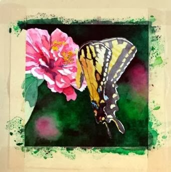
Pink Sugar
 |
| "Pink Sugar" - 5"x5" |
So here is the finished version of my annual commission for my friend. I did a lot of work to develop the details of the butterfly, and, even though I loved the hard contrasts in the Zinnia's petals, I decided that I had to knock it back a bit so it wouldn't compete with the butterfly too much. So I think the brightly lit area at the top of the wings is the point of entry now, with lots of places to explore within the composition.
The other significant change was the pink blob toward the bottom. It kept getting in the way, I decided. To fulfill one of the "rules" listed in my previous post (little to no detail beyond the subject) it had to go. So the area was scrubbed and dark greens dropped in. I think that change helped things immensely.
And I'm happy to report that my friend was pleased with her painting!
Sunday, February 2, 2014
Butterfly commission

Each January I have a "commission" from a friend and co-worker. I put the word commission in quotation marks because she allows me to choose the subject of the painting, so I have freedom in this project that most commissions would not normally afford.
I keep her paintings within the parameters of floral subjects, with a couple of still life compositions thrown in. We counted up this year, and she now has six of my pieces, five of them being original paintings (one is a print because the original that she wanted had already sold by the time she saw it. Since then, I paint works just for her each January to ensure that she gets the original).
***
I must give credit to my mother for the inspiration of this project. She grows many, many flowers around her house, through all seasons. She now has a nice camera that she's been using to capture the fleeting glory of her blooms.
In this case, a large Tiger Swallowtail had taken up residence among a group of pink Zinnias, and the butterfly had no intentions of leaving his post while mom snapped photographs. So she has several closeups of blooms with the butterfly hard at work extracting sweet gifts. I saw the images, and immediately thought of my commission project.
I thought about the paintings that I see other accomplished floral painters create, and I decided there were essential elements to making these compositions work, particularly when the painting is quite small.
- Tight focus on a primary subject
- Little to no detail beyond the subject
- Extreme value contrasts
- Dramatic lighting
With these "rules" in mind, I settled on a new image, mostly because I liked the little shadows some petals cast on the petals below. I thought that, plus the glow of light through the butterfly's wing, added the "dramatic" element, as well as helped with the value contrasts. I then cropped tightly on the subject and ignored all the background elements.
At this point, the painting is close to finished, but I have work yet to do with the butterfly. Stay tuned for the final product!
Sunday, January 26, 2014
Turn of Fortune
 |
| "Turn of Fortune" - 15"x15" |
I finally finished my painting in progress, so with two completed works, I set up the umbrella lights to photograph "Turn of Fortune." I'm so glad to finally share this one since I am still pleased with how it came out.
The subject, as you might be able to tell now, is part of the impressive mechanism that makes up a massive bank vault door. This vault was installed decades ago, when it was still important to visually impress the banking public. Vault doors in more modern bank buildings are downright boring in comparison...so I'm glad to see this shiny monster in action.
As I explained in an earlier blog post, the hard work with this painting was in the early going....huge wet washes running all over the place and every time I would try to adjust something I'd end up with blooms and backruns intruding in areas that I thought were finished. Stressful indeed.
I understand why there is so much movement toward the "pouring" concept in watercolor -- huge areas can be evenly covered with pigment with little worry about blooms and backruns because large sections are methodically protected by sections and layers of masking fluid. To see the final results of the pouring method, check out a section of Leslie Redhead's blog that features her poured watercolor works: http://leslieredheadart.blogspot.com/p/poured-watercolors.html
As you can see from Leslie's work, the results can be stunning, with deep contrasts and luminous passages. I considered that method as a way of attacking this subject, in fact. But I really don't like using masking fluid - mostly because I'm lazy and I don't like the mess. So after much thought, I only used masking for the bright little highlights in this painting, and took my rubs as I fought to keep my washes in check with large flat brushes.
In this case, I think the fight was worth it.
Wednesday, January 15, 2014
Our Wheel of Fortune


Since this painting is too large for me to easily scan and assemble on my little flatbed scanner (scan area of 8.5x11), I have to photograph it, which requires setting up umbrella light stands, etc. And that requires moving most of the furniture in my small room. So the final image for this painting will have to wait for a while....hopefully when I have another painting or so finished, so I can make the most of the elaborate lighting setup.
So, I snapped some really awful photos with my cell phone camera, and tried to do a rough color adjustment on them...but the tones are really off and are washed out. So I'll have to content myself with posting these little snippets of the final painting for now. Let's say that I am pleased with the final product.
Subscribe to:
Posts (Atom)