Thursday, May 26, 2011

Vacation sketch

We had a great time at Babcock State Park this year. Unfortunately, it rained more that we would have liked, so our outdoor activities were somewhat limited.

On our only sunny afternoon, we were quite industrious, hiking to the famed Long Point to see a spectacular view of the New River Gorge Bridge. On our return to the park, we wandered down to the Glade Creek Mill to enjoy the scenery and sunshine.

I settled on a rock by the creek's banks, and drew this scene. I then tinted it with my handy travel brushes that carry a water reservoir in the handle, but I have to admit the results were less than stellar. I've used the brushes before while on vacation with some success (see this post to understand what kind of brushes I'm describing), but I was unhappy with this effort.

So, the sketch you see below is actually a new drawing based on the original sketch, and I will tint it using my regular watercolor brushes. When drawing I use pencil first, then go over that sketch with Pigma Micron pens in three thicknesses.

When I've added the watercolor, I'll post a new image.


Friday, May 6, 2011

Postcard promotion


I promise I will post about painting soon... or at least as soon as I put my brush to paper again.

But in the meantime, I had to share this wonderful card that I received in the mail today from Anne Finlayson at VMRC. That's my painting in the bottom corner, and I am so surprised and elated to see that they chose that image for the promotional cards for the show.

Anne also sent one of the color brochures listing all the participants. That piece also includes some images of the accepted artwork, and "Wisdom Watching" was included there! So I'm really happy and humbled to see images of my work alongside the pieces of other artists. "How did that happen?" pops into my head every time I see them.

So, as the card above indicates, the show opens May 29 and runs through June 30 at the Park Gables Gallery at the Virginia Mennonite Retirement Community, 1491 Virginia Ave., in Harrisonburg, Va. Hours are 10 a.m. to 7 p.m. Monday through Friday, and 1 to 4 p.m. Saturday and Sunday.

Wednesday, May 4, 2011

Faces finished


Here are the long-promised close-ups of the faces in my most recent painting. So far all reactions to the painting have been positive, and I'm generally pleased with how it developed.

The faces have been developed using Jane Paul Angelhart's palette of transparent and semi-transparent colors. However, I did substitute one of her stalwart pigments, Holbein Olive Green, in favor of MaimeriBlu Sap Green.

I have found in difficult to work with the Olive Green in some past paintings because it pushes toward orange tones when glazed with reds and pinks. I found that the Sap Green was more neutral in skin tone applications. I want to test that idea further in my next attempt at a portrait.

Saturday, April 23, 2011

One Moment


Well, I've wrapped up this painting just in time for the entry deadline to the West Virginia Watercolor Society show. I've been working on this for about eight weeks, including the drawing, so I admit that I've reached a level of fatigue that says it's time to stop.

This is only my fourth portrait painting, so I'm still struggling with some things, but I am certainly pleased with how her face turned out. In the post where I had included closeups of their faces at an earlier stage, you can see how the lines and texture of her face were created with little bits of color.

It looked rough at that point, but a simply wash over a larger area melted all the bits together into a realistic portrayal. I'll try to scan the faces again so in a new post you can see a close up view of what I'm describing.

Honestly, I had a lot more trouble with his profile. Not having the lines and features of a face made it more difficult, and then there was the problem of creating a sense of texture in his weathered profile. My first washes were very much like my previous portraits of children...very smooth. And for him that was completely wrong. So it look a long while to build up enough thin washes to create the illusion of a mature adult's skin, but it finally worked.

Tuesday, April 19, 2011

Accepted at VMRC

Wisdom Watching

Shall We Gather


I received my letter from the VMRC annual exhibit this weekend, and I'm so surprised and pleased that I've had two works accepted in their eighth annual show!

The Virginia Mennonite Retirement Community is the host for the multimedia show, which is advertised in most of the national art magazines and artist call websites. I attempted to enter it once before, but I've always thought that my work was too ordinary to ever make it. The panel of jurors usually includes university faculty, and selections cover a wide range of styles and approaches.

Exhibit coordinator Anne Finlayson included some statistics in the notification letter. There were 532 entries made by 189 artists representing 31 states. The exhibition will include 103 pieces by 97 artists from 23 states...and I have two pieces (Wisdom Watching and Shall We Gather) included!

The exhibit will run from May 29 to June 30 in the Park Gables Gallery at VMRC, Harrisonburg, Va. More on the exhibit can be found on their website: http://www.vmrc.org/v.php?pg=48

Thursday, April 14, 2011

Beautiful brush vase


I'm sorry this post has little to do with painting, but I had to share my wonderful find!

I went to Tamarack last weekend to pick up my paintings from the "Architectonic" show. Tamarack is mostly a showplace for fine craft, with the Dickirson Gallery as a revolving space for fine art. So I love to wander about the different sections to see the glassware, ceramics, jewelry, etc.

In the ceramics section, I decided I wanted a beautiful piece to hold my brushes. I've always used random coffee mugs, and they're never quite large enough, particularly with several flat wash brushes in the bunch.

So here is my find! It's made by a young potter named Lindsay Philabaun who lives in St. Albans, W.Va. This pattern has been her signature design, but she's adding some floral patterns into her product line. You can see her work at her website: www.lindsayphilabaun.com

Friday, April 1, 2011

Faces


I've included some close-up shots of my latest painting in progress. I can't decide how well it's really going because I swing from optimism to pessimism every few moments as I work.

It's not turning out quite as I had intended...but I press on, determined to learn what I can from my mistakes.

UPDATE: I had to go back in and update the photos for this post because they were so badly taken. So these images better represent where I'm at in this painting now.

Saturday, March 26, 2011

Shall We Gather?


I believe I've done all the damage I'm willing to do on this topic. And I'm still not certain which one I prefer. In some ways I am pleased with the more value-dependent first version, but I do like certain aspects of this one as well.

Which do you prefer?

Saturday, March 19, 2011

More butterflies


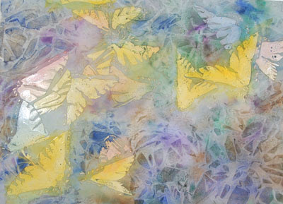
So here is the result of the plastic wrap. . . pretty nifty! And, the bonus benefit is that the technique can be completed more quickly than the careful layers I built up in the first version.

Now, I'm not saying that carefully painted "random" shapes aren't fun . . . but truly, there is a benefit in regard to the paper's surface. I had so many thin layers of paint on the previous painting that when I got to the end, I was having difficulty keeping a crisp edge on some of the darkest ares. The paper sizing was no longer effective, and feathers and bleeds were creeping into completed sections every time I applied fresh, dark color. So, reaching this level of texture with only a single application of pigment and water was very helpful in the long run.

I next applied one layer of a neutral tone over the plastic wrap effects to unify the patterns and then tackled the difficult section: evenly applying a mixed black throughout the painting.


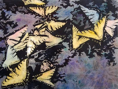
The darkest design shapes hold the composition together, I think. Here you can see the butterflies still covered in their masking fluid, surrounded by dark, velvety passages.

I mixed my black from Permanent Alizarin Crimson and Pthalo Green. It works wonderfully as a dark staining color, but it also tends to shift from green to purple if I don't have the proper balance of pigments in the mix. When dry, I went back over the dark areas once more, and added a touch of Cobalt Blue to the mix to even out the color shifts.

I had applied some masking fluid to areas that were wholly contained within the largest dark areas to preserve them, but the outer edges of all the convoluted shapes were painted freehand. I had to work quickly, and always stay ahead of the wet edge of paint to avoid obvious brushstrokes. Keeping these shapes sharp and flat-toned was critical to my concept in this painting.

Wednesday, March 16, 2011

Butterflies reprised


Well, the butterflies intrigued me enough that I thought I would try them again, and this time I took some process photographs.

The new version of the painting is much larger -- nearly 24 inches across versus 14 inches for the original.

I first wet down the sheet and then dropped color into the areas of the butterflies. I also decided to go a little wild with some of the colors, so I have some blue, green and pink butterflies among the yellow ones.

After those soft color blossoms dried, I spent hours carefully masking the butterflies. I used some tape in larger areas, and carefully sealed those edges with masking fluid. Then the masking fluid went around the taped areas and into all the nooks and crannies that make up the butterfly shapes. I didn't photograph the masking stage...my masking fluid is colorless, so there wasn't much to see.


This image shows my next step -- painting over the entire painting with dark colors, and then crumpling sheets of plastic wrap into the wet paint. In the first version of the painting, I carefully painted all the textured effects. For this one, I wanted to try the random texturizing that plastic wrap could provide. The wet pools of color also tended to intensify pure pigments, so some colorful patches -- ranging from dark purple, to green to blue -- were created along with the texture.

I let the plastic wrap stay on the wet surface for about an hour. Then I carefully peeled the plastic off so the entire surface could completely dry.