
 |
| "Solitude" - 8x8 |
So after many hesitant revisions, this little painting joins the ranks of the Wardensville series.
In many ways, this project may be the closest I've come to following Bill Vrscak's advice: (see my earlier blog post on Bill Vrscak) ..."the best compositions are developed via sketching and simplification -- to [Vrscak] a painting should not be an exact copy of a scene or subject because that's what photography is for. Instead, painters must remember that what is on the surface of the paper is far more important than what the painter is seeing."
Well, given the quality of my source photograph, sketching and simplification were my only options.

I took the photo with my cell phone while on a morning walk. I don't know what attracted me to the scene, given all the obstacles between me and the focal point. But I know that I often see "glimmers" of paintings as I walk and/or drive around. If I pause and look more closely, the vision seems to vanish. So I'm beginning to trust my instincts, snap a photo, and ask questions later.
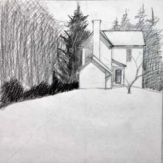
So here was my first simple sketch of the scene:
 |
| First sketch |
Working to refine the shape of the house, I then did this sketch. This drawing also determined the direction of the light and how the shadows were cast on the different sections on the house. Additionally, I moved the house "up" on the hill.
 |
| Second sketch |
 |
| Value #1 |
 |
| Value #2 |
The purpose of these little paintings was to figure out how I wanted to break up the mass of foliage that surrounds the house. I knew the contrast between the large pine to the left and the house was critical, but I wanted to play with other values around those key elements.
Now it was time to paint...

In this early stage, I tried, per Bill Vrscak's advice, to block in big shapes first. I also tried to make the outlines of those shapes interesting, and to vary the colors within the shapes so they wouldn't be flat and boring. Since the light was hitting from the right, I used more yellows to that side, and added cooler blues as I worked to the left.
From the value paintings, I had decided to not worry about any details in the foliage, and to push it all to the background. However, when looking at the painting at this point, I began to feel that it was too simple and too boring. So I stopped working on it for quite a while, and kept thinking about it. Finally I decided that I had to lift some of the wash to the left side, and develop some sense of hanging foliage that would add depth to the foreground elements. So the next stage shows that mass of foreground foliage as it starts to develop.
Along the way, you may have noticed that I eliminated the little tree that had been growing in front of the house. I had the tree in my pencil sketches, but in distilling the lessons of those early sketches, I decided that it was the shape of the house against the dark background that drew my interest. That contrast seemed dramatic, perhaps even mysterious. Obscuring that stark contrast with the mid-ground tree seemed superfluous, so I eliminated the tree from the design.

At this stage, I had also worked to break up the foliage areas surrounding the house, and developed the foreground to add texture and interest to what otherwise could be a large boring shape.
To finish up, I strengthened the cast shadows in the house, and added some very slight touches of detail. I didn't want to fuss over the house, and I think I kept it fairly simply, yet it reads in a realistic manner.
|
| "Solitude" - 8x8 |
No comments:
Post a Comment