Tuesday, December 31, 2013

Progress

Things are still developing with the new painting. I think I will have to take a lot of time to develop the reflections in a realistic manner.

Most of my attention at the moment is focused on balancing the overall values. There are lots of areas in this composition that have the potential to attract too much attention, especially with all the bright, reflective highlights. So I'm working on tamping down the contrasts in the less important areas.

I've got an army of brushes at work....I'm using the RS White Sable flats, and my usual synthetic rounds, but I've also got three Princeton Neptune brushes at work. They are made with "synthetic squirrel," and they allow me to go back into areas without disturbing the underlying washes. They also are a huge help in blending.

Saturday, December 28, 2013

Heavy metal


I am steadily working on my current project. I'll hold off identifying the subject right now, but I think it might be familiar to some. I think it's an unusual subject, and it's one that I've contemplated doing for some time. The demands of the Wardensville series has finally pushed me to it!

This is my largest painting this year...15x15...and doing these big, wet washes has been a challenge. I think that's why I avoid larger works. It takes a lot of concentration to keep things under control when you have washes running all over the place. This size requires the use of large, flat brushes, which hold more pigment (and more water!).

That's where I often make a mess of things, because I'll try to "fix" something, and then a massive bloom will erupt, and then I'll mess up all sorts of other areas to "fix" the solution to my first "fix," and then it spirals out of control. Agh! Then I swear off big brushes and return to my little paintings for a while.

But, in this case, so far so good. I'm finished with the big areas, so I can concentrate on developing the forms.

I'm working essentially with three colors - a cool blue and cool yellow, and a warm red. I like the neutrals produced by this mix.

Wednesday, December 25, 2013

"Winter Whites"

"Winter Whites" - 12"x12"

Merry Christmas!

I am pleased with the painting that I used for my Christmas cards this year. Normally I use a tiny little painting that's no larger than the image size that ends up on my 5x7 cards. This year, I tried something very different, and painted a large painting, 12x12.

I also used some different techniques - namely in reserving some of the whites. I have done a very limited experiment in the past with white crayons to reserve an area of whites, and I don't think it worked very well because of the opaque nature of the white crayon.

This time, I got a pack of clear wax crayons specifically designed for use with artists' materials, and that's what's reserving most of the white areas of the snow-covered foliage on the embankment above the roadway. There's a bit of that treatment in the background trees above the house as well.

Most of the foreground snowbank is made of areas that I painted around with a large brush, as is the snow-covered roof of the house. In fact, I used no masking fluid anywhere on this painting, which is a first for any of my snowy scenes.

Other lighter areas were created by dropping water into fresh paint, which created lovely blossom effects (good for lacy bits of vegetation). I really wanted a loose feel with this painting, and I think I managed that. I really feel that I am fussing far too much on some paintings, and it's sapping vitality from the final product.

I felt reinforced in that belief a few weeks ago after seeing the new Van Gogh exhibition at the Phillips Collection in Washington D.C. called "Repetitions," which examines Van Gogh paintings where he completed the same composition multiple times. Generally, I always felt that I preferred the earliest versions of these series because they seemed fresher and more energetic.

I'm also pleased that multiple people have correctly recognized the location of this painting, even though I have changed elements to improve the composition. That indicates that I've got the essence of the scene, with minimal hand-wringing. I'll call that a success!

Saturday, December 14, 2013

Signature member of WVWS


I'm happy to report that I've earned Signature Status in the West Virginia Watercolor Society!

I submitted a portfolio of works to the WVWS Jury Committee who anonymously reviewed the paintings and engaged in a critique session. Committee members then vote on the merits of the portfolio to determine if the applicant should gain the status sought for in the application.

I received my mailed notice of acceptance, as well as copies of the reviewers' critiques, at the beginning of the month.

For the 2013 review period, I earned Signature Status, along with WVWS members Andrea Burke, Monica Wilkins and Debbie Lester.

Julia Jones, who also lives in Hardy County, received her Juried Status during this review as well.

Congratulations to all these fine artists!

Learn more about the West Virginia Watercolor Society at www.wvwatercolorsociety.org.

Here are the pieces that I submitted for the committee's review:


Saturday, December 7, 2013

West Virginia Juried Exhibition honors

"Mumbles and Squeaks"
I am very pleased to report that when I attended the opening of the West Virginia Juried Exhibiton in Martinsburg, W.Va., on Nov. 24, I learned that I was among the award winners!

The biennial exhibition features 53 works created by 46 West Virginia artists. West Virginia Division of Culture and History Commissioner Randall Reid-Smith told the group that jurors Samantha Wall and Julie Peppito reviewed more than 500 entries for the exhibition.

Of the 53 pieces, 18 won awards. The Governor's Awards (3) are valued at $5,000; the Awards of Excellence (7) are valued at $2,000; and the Merit Awards (8) are valued at $500.

I am proud to say that I was among the Merit Award winners.

Here I am, looking at my painting at the 2013 West Virginia Juried Exhibition!
Simply getting into this exhibition has been one of my goals since 2007, and this was the first year that I made the attempt. So just having my painting on the wall was my prize - that I won an award is a bonus.

The press release from the Division, which lists all the participants, can be found here: http://www.wvculture.org/news.aspx?Agency=Division&Id=2382

A gallery of the award winning pieces can be found here: http://wvculture.zenfolio.com/juried

And images from the exhibition's opening, including me receiving my award, can be found here: http://wvculture.zenfolio.com/juriedopening

Wednesday, November 27, 2013

Stephens Fort at Old Forge Farm

"Old Forge Farm"
I did this little painting as a thank you to my friend Jimmy.

Jimmy's family owns a remarkable farm that includes several buildings that pre-date the American Revolution. It was the site of an "iron plantation," one of the earliest manufacturing sites in the Northern Shenandoah Valley, operated by Isaac Zane.

Jimmy hosted us on a tour of some of the property, as we searched for bits that would indicate the location of the iron furnace. Its massive stones were hauled off prior to the Civil War for other building projects. But evidence of "slag" - the glassy byproduct of early iron production practices - and charcoal were everywhere. It was a fun visit, and our group was very appreciative of Jimmy's willingness to host us.

This scene shows what is known as "Stephens Fort," with the historical manor house in the background. Based on its design, and because of its similarities to another structure that I've seen in Elkins, W.Va., I think it was used as an "ice house" for storing perishables. There are two subterranean levels - reaching more than 24 feet below ground - and the shape is hexagonal on the surface (you only see two sides in this scene) and round below ground.

The remarkable structure is called "Stephens Fort" because it is widely believed that it was used as a shelter for local families during Indian raids in the period of the French and Indian War. Many sorts of structures were used as "forts" during this time period, including sturdy log cabins such as Fort Ashby in Fort Ashby, W.Va.

Thank you again, Jimmy, for being such a great host and friend.

Monday, October 21, 2013

Solitude

"Solitude" - 8x8

So after many hesitant revisions, this little painting joins the ranks of the Wardensville series.

In many ways, this project may be the closest I've come to following Bill Vrscak's advice: (see my earlier blog post on Bill Vrscak) ..."the best compositions are developed via sketching and simplification -- to [Vrscak] a painting should not be an exact copy of a scene or subject because that's what photography is for. Instead, painters must remember that what is on the surface of the paper is far more important than what the painter is seeing."

Well, given the quality of my source photograph, sketching and simplification were my only options.


I took the photo with my cell phone while on a morning walk. I don't know what attracted me to the scene, given all the obstacles between me and the focal point. But I know that I often see "glimmers" of paintings as I walk and/or drive around. If I pause and look more closely, the vision seems to vanish. So I'm beginning to trust my instincts, snap a photo, and ask questions later.

So here was my first simple sketch of the scene:

First sketch
It's very rough, but what I liked was the contrast between the background foliage shapes and the hard white geometry of the house.

Working to refine the shape of the house, I then did this sketch. This drawing also determined the direction of the light and how the shadows were cast on the different sections on the house. Additionally, I moved the house "up" on the hill.

Second sketch
A couple of watercolor value paintings were next, which I had posted in an earlier blog entry:

Value #1
Value #2
The purpose of these little paintings was to figure out how I wanted to break up the mass of foliage that surrounds the house. I knew the contrast between the large pine to the left and the house was critical, but I wanted to play with other values around those key elements.

Now it was time to paint...


In this early stage, I tried, per Bill Vrscak's advice, to block in big shapes first. I also  tried to make the outlines of those shapes interesting, and to vary the colors within the shapes so they wouldn't be flat and boring. Since the light was hitting from the right, I used more yellows to that side, and added cooler blues as I worked to the left.

From the value paintings, I had decided to not worry about any details in the foliage, and to push it all to the background. However, when looking at the painting at this point, I began to feel that it was too simple and too boring. So I stopped working on it for quite a while, and kept thinking about it. Finally I decided that I had to lift some of the wash to the left side, and develop some sense of hanging foliage that would add depth to the foreground elements. So the next stage shows that mass of foreground foliage as it starts to develop.

Along the way, you may have noticed that I eliminated the little tree that had been growing in front of the house. I had the tree in my pencil sketches, but in distilling the lessons of those early sketches, I decided that it was the shape of the house against the dark background that drew my interest. That contrast seemed dramatic, perhaps even mysterious. Obscuring that stark contrast with the mid-ground tree seemed superfluous, so I eliminated the tree from the design.

At this stage, I had also worked to break up the foliage areas surrounding the house, and developed the foreground to add texture and interest to what otherwise could be a large boring shape.

To finish up, I strengthened the cast shadows in the house, and added some very slight touches of detail. I didn't want to fuss over the house, and I think I kept it fairly simply, yet it reads in a realistic manner.
"Solitude" - 8x8

Wednesday, October 16, 2013

W.Va. Juried Exhibition


"Mumbles and Squeaks"
I wanted to share this press release with you...because "Mumbles and Squeaks" has been accepted into the exhibition!

+++


West Virginia Division of Culture and History to Unveil Juried Art Exhibition in Martinsburg in November


MARTINSBURG, W.Va. — The West Virginia Division of Culture and History will unveil the 18th West Virginia Juried Exhibition at the Dunn Building in Martinsburg at 2 p.m. on Sunday, Nov. 24, at a reception that is free and open to the public.

Introduced by the Division in 1979, this biennial event showcases the work of state artists and craftspeople while providing the Division with an opportunity to purchase award-winning art for the West Virginia State Museum art collection.  The exhibition features painting, sculpture, printmaking, drawing, photography, mixed media and crafts, and will remain on display through February 2014. 

The West Virginia Division of Culture and History proudly presents this exhibition in partnership with the West Virginia Commission on the Arts and with support from the West Virginia Legislature, which appropriates funding for the exhibition’s awards.

The awards for this exhibition include:
·     Governor’s Awards:  Up to three $5,000 purchase awards, with one award designated the D. Gene Jordon Memorial Award.
·     Awards of Excellence:  Up to seven $2,000 purchase awards.
·     Merit Awards:  Up to eight $500 awards.  These are not purchase awards.

For more information about the West Virginia Juried Exhibition 2013, contact Caryn Gresham, deputy commissioner, at (304) 558-0220 or at caryn.s.gresham@wv.gov.

The West Virginia Division of Culture and History is an agency within the West Virginia Department of Education and the Arts with Kay Goodwin, Cabinet Secretary. The Division, led by Commissioner Randall Reid-Smith, brings together the past, present and future through programs and services focusing on archives and history, arts, historic preservation and museums. For more information about the Division’s programs, events and sites, visit www.wvculture.org. The Division of Culture and History is an Equal Opportunity/Affirmative Action Employer.

Monday, September 16, 2013

The "F" word

Yes, that's right. It's the "F" word: Facebook.

I've followed the crowd into social media. Mind you, I don't have a personal Facebook page and don't intend to create one. However, I've found more and more that artists, arts advocacy groups, and galleries are spreading the word about events, shows and more through Facebook.

So, now I have Facebook logos on my website and blog that link to my Facebook page, which is at www.Facebook.com/WaitesRunStudios.

I've been on Facebook for a couple of weeks and I've noted its strengths and weaknesses. In short, it seems most effective with images and short, snappy posts.

But, as a writer, I find that format to be a little too confining. So I don't intend to give up this blog. It's the perfect place to write about painting at length - with topics such as techniques, materials, design principles, inspiration and more.

I view the Facebook page as a way to announce events. It's also useful, I think, to introduce more people to watercolor painting,  mostly by sharing images of paintings in process. And I will use Facebook to encourage "Friends" to visit this blog to learn more about the medium.

That said, I encourage you to "Like" my Facebook page to keep up with the new nuggets of information that I share there.

Wednesday, September 11, 2013

Pittsburgh Society of Illustrators


Anni Matsick, the newsletter editor for the Pittsburgh Society of Illustrators, included a blurb about my Bill Vrscak workshop blog post in the July issue of the society's newsletter and included a photo from Morgantown Art Association member Byron Witt.

Bill Vrscak is also a member of PSI. You can read my account of his workshop at http://waitesrunstudios.blogspot.com/2013/06/bill-vrscak-workshop-in-morgantown.html

Visit http://www.pittsburghillustrators.org/ to see the entire PSI July newsletter in pdf format and to learn more about this great organization and its many talented members. Be sure to check out the website of Anni Matsick as well: http://annimatsick.com/

Saturday, September 7, 2013

School Days

"School Days" - 8"x8"

I painted this one twice.

In the first version, I got too dark too quickly in the cast shadow areas, so there was no sense of warm sunshine in the painting. When I looked at it from a distance, all I could see was a hard diagonal shape that dominated the scene.

So I tried to use opaque watercolor - in this case, watercolor mixed with gouache - to paint over it and try something different.

That experiment didn't go well. There's a strange drying shift in opaque watercolors that I can't get a handle on. Traditional watercolors tend to look dark while the wash is still wet, and then lighten while drying. Over time, you get used to this drying shift.

Once you mix the watercolors with white gouache or with opaque titanium white watercolor, then the opposite happens. They dry darker. And that difference drives me crazy. I have no sense of how anything will eventually look while I'm putting it down.

Secondly, I think the appeal of oil and acrylic paintings - at least for me - is seeing all those bits of colors that peek through, particularly with the alla prima painting technique. I could not get any such effect in my experiment because the watercolor paint dries so quickly. So I ended up with masses of sharp-edged and flat shapes that were not very interesting to look at.

An application of colored pencil over the opaque watercolor finished off that piece of paper (the cold press paper is just too rough), so I transferred the drawing to a fresh piece of Arches cold press paper and started again.

The second time I learned from my mistakes.

This image is something of a composite, which is still very hard for me to do. The scene no longer looks like this -- the doors have been removed and replaced with modern, metal-framed glass doors. But I thought it would be more appealing to go back in time and reconstruct the doors as they were when the Wardensville School was still open. I couldn't find any clear images from WHS yearbooks, so I cobbled the doors together in my mind's eye. I hope I got close.

Only seven days and the mini exhibit of my Wardensville paintings will be on display at the WHS alumni dinner. The Wardensville Scholarship Fund Association benefit auction of my donated painting is that evening too!

Monday, September 2, 2013

Value studies


I am working from a really poor photo reference, so I'm essentially making this scene up. So that should make for a good painting...if I had the skill set of Bill Vrscak. But I'm certainly not there yet, so this challenge worries me.

So, I've resorted to doing some little value paintings to try to figure out how I want to develop all the foliage around the structure. Here are two of the options.

I guess it's time to scale things up to full size...

Wednesday, August 28, 2013

Sunlit


"Sunlit" - 8"x8"

Another completion in the Wardensville series...with many more yet to go.

I'd like to talk a little bit about why I'm working on this series. I first mentioned the idea in a blog post last year (read it here), and to recap, I am focusing on scenes that I think we all overlook.

It's completely understandable that this happens, by the way. It's simply part of living in a space, whether it's as small as your desk at work or as large as your community, and becoming so familiar with the space that you become blind to it.

It's only when there is something out of place, whether it's something that's new, something that is changed, or something that is removed, that you pause and take note.

So the space that I'm focusing on is the community in which I live. So far, the most successful parts of the series, in my estimation, have been "Red Shed" and "Shadow Play" and "Side Alley." I think these scenes are all somewhat surprising, and it may take even longtime residents a few moments of reflection to recognize the locations. And when they do, I hope they enjoy a different perspective of the scene, even if it only lasts for a few moments.

Obviously, not every person seeing these paintings will know where they come from. After all, Wardensville is a very small town. So I still have to entertain those people as well, and for them I must develop compositions that are pleasing and balanced.

I really am enjoying this notion of finding the extraordinary in the everyday. I hope you may also wish to reassess the spaces around you...and find something valuable in the process.

Sunday, August 11, 2013

Old Glory


"Old Glory" - 8"x8"
I'm still working on the paintings for the Wardensville series, and trying to get enough of them done that I can do a little display at the Wardensville Alumni Dinner in September, to complement the benefit auction of my "Warriors Win" painting.

I've run into all sorts of problems with the three most recent paintings in the series. Often it seems I spend more time scrubbing pigment off the paper than putting pigment down. I hope it's just a phase and I can snap back into some more efficient painting soon. Right now, I feel really tentative with what I'm doing.

Friday, July 26, 2013

Benefit auction for Wardensville Scholarship Fund Association


The painting I did for the Wardensville Scholarship Fund Association benefit is now on display in the lobby of Capon Valley Bank, along with information about making a bid on the painting, which will be sold at auction on Sept. 14 during the Wardensville High School Alumni Dinner. All proceeds from the auction will go to WSFA.

"Warriors Win" - 12"x12"
As usual, I have stressed mightily over this painting, particularly since it's being used for this public fundraising event. So far reactions have been positive. I hope that trend continues, and I hope the painting auction raises funds for WFSA.

One of the most complicated parts of this painting was the original drawing, particularly of the basketball net. Initially, I tried to draw each strand...and ended up getting really confused. So I started over, and instead concentrated on drawing the spaces between the strands -- essentially breaking it down into a bunch of abstract shapes. That approach worked. I suppose it's the same as when you draw upside down, or in reverse, to trick your brain into focusing on raw shapes, rather than what the brain thinks it is seeing.

The other difficult part was in the development of the painting itself, as I kept battling the balance between the foreground and background elements. I used contrast and edge sharpness/softness as my main design tools in this battle. I'm still not sure how successful I have been, but in time I'll have a better sense of it. It's difficult to assess a painting when it's still under your nails and in your dreams.

Thursday, July 4, 2013

Copyright and trademark: A guide for artists


I'm been very conscious of legal issues in relation to art since the beginning. I had a high school teacher who told us that the safest thing we could do regarding reference materials for paintings was to stick to images we photographed, rather than using others' photographs.

I've followed that advice every since.

I once did a painting, also while in high school, that was based on a photograph I had taken of a bunch of vintage items stored in a cousin's barn. Among the items was an old Pepsi sign. I really liked the painting, but I always wondered if I should have included the Pepsi sign.

In recent years, I've read about controversies at large national and regional watercolor shows concerning entries that utilized stock photographs as sources. I've also read about the plagiarism controversy and lawsuit regarding the Associated Press and artist Shepard Fairey, who designed the famous HOPE poster from the 2008 presidential campaign, based on an AP photograph of Barack Obama. You can read about the settlement between Fairey and the AP here and about the related criminal proceeding against Fairey here.

So I took note when I read on artist Carrie Waller's blog that she recently had a painting rejected from a show because the show organizers were concerned that her inclusion of iconic canning jars infringed on the manufacturer's trademark rights. Read about her account of the painting's rejection on her blog: http://carriewaller.blogspot.com/2013/06/blue-skies-show-acceptance-and-there-is.html

"Anticipation" by Carrie Waller
Image used with the artist's permission.
http://carriewallerfineart.com/
http://carriewaller.blogspot.com/
In a follow-up to that post, Carrie made contact with another artist, Kim Minichiello (www.kimminichiello.com  and http://blog.kimminichiello.com), who is familiar with such legal issues because of her experience with art licensing. Kim subsequently wrote two guest blog posts on Carrie's site that explain copyright and trademark issues as they pertain to artists.

I heartily suggest that all artists should educate themselves on these important issues, and the posts on Carrie Waller's blog by Kim Minichiello are a great place to start!

To learn more, click through the links below:


To learn about
trademarks.


To read about
copyrights.


I also encourage everyone to look at Carrie and Kim's respective websites. They are both fine watercolorists! I also thank Carrie and Kim for allowing me to share their information on my blog.

Wednesday, June 26, 2013

Wade in the Water(color)!


Class participants Pammy (from left) Rachel, Shirelene,
Suenette and Michelle stand behind their completed iris paintings

Well, I am still recovering from the whirlwind workshop held this weekend as part of the Grant County Summer Arts Program. I taught a beginner watercolor workshop to five energetic and talented ladies (and one very talented 9-year-old boy as well) and we packed a bunch of information and projects into a day and half.

I can't say enough about the willingness of the group to work hard and stick with me because I probably tried to do too much given the limited time period.

A congratulatory group hug with some of the ladies.
When I teach a beginner-level class, I go through the basics of materials, as well as discuss some of the essential "tools" of the trade -- flat washes, graded washes, wet-into-wet, dry brush,  masking, textural effects, etc.

I believe that success in painting is more a result of determination and effort rather than a reward for "talent," and I want students to have some basic skills when they walk out of my class. My hope is that they will be interested enough in the painting experience that they want to work on developing those skills and adding to their repertoire of "tools."

As part of that step-by-step progression, the group worked its way through some introductory exercises to become familiar with the feel of the brushes and the paint.

I had several projects prepared for the class, which allowed them to sample a couple of different watercolor papers (a "student-grade" paper from Canson, as well as 140# cold press Arches).  I predraw the basic outlines of the projects on the papers ahead of time. I do this for two reason: first, as a simple time-saving element, and second, because I am teaching a painting class, not a drawing class.

For nearly every participant, this is the first time they have attempted watercolor (aside from playing with the cheap children's kits), so they have enough to worry about in just getting the pigment off their brushes and onto the paper. I don't want to place undue stress on them by making them draw. Instead, I want them to concentrate on how the paper and pigment react.

Once we had the warm-ups finished, we turned to a rural landscape depicted with a single pigment. It's essentially a value study, and the goal is to apply the warm-up skills to a painting, to see how a graded wash adds realism to a cast shadow, how charging pigment into a wet area can create soft foliage, and how a painting can come to life through patient problem solving.

We followed that painting with a couple of color exercises - one a star-spangled decorative item that illustrated the magic that water and pigment can make when left to their own devices, and the other a simple yet dramatic sunset over a mountain range. And that was only the first day!!!

The second session started in the afternoon, with a small floral as the capstone project for the workshop. I did a small amount of demonstrating with this subject, mostly to give everyone ideas on how to approach the initial washes, and to impress upon the group that soft glazes are often key to building realism -- and confidence. I tend to "sneak up" on most paintings, using multiple washes and glazes. After watching me, the group proceeded to work on their own irises, and I went around to each as they painted.

That final session ran long (we were supposed to conclude at 4 p.m. but it was well after 5 when we did finish), but ultimately everyone came out with a really nice iris painting. And, more importantly, the group all seemed happy with what they had learned, were pleased with at least some, if not all their results, and were amenable to further explorations in the medium. And that's what I truly hope for -- that they might consider picking up a brush again in the future.

I want to thank the organizers for the Summer Arts Program in Grant County for inviting me to participate in their program and I also want to thank the Grant County Press (www.grantcountypress.com) and the Grant County Arts Council for helping to publicize the class.

Sunday, June 16, 2013

Bill Vrscak workshop in Morgantown


Photo by D. Byron Witt and used with permission.
Bill Vrscak (left) talks to participants at the
Morgantown Art Association's spring workshop in April 2013.

Photo sourced from Morgantown Art Association's Facebook page:
https://www.facebook.com/pages/Morgantown-Art-Association/304517989577522


I'm going to try to encapsulate my experience at the Bill Vrscak workshop in early April, hosted by the Morgantown Art Association (www.morgantownartassociation.com). Bill is a painter and graphic artist from the Pittsburgh area, and I've known about his watercolors for quite some time. (You can see examples at his website http://www.billvrscak.com/) So it was with great excitement that I learned that MAA was organizing a four-day watercolor workshop with him.

Bill demonstrated each morning, and then we turned to our own boards and attempted to nail his ideas and techniques down with brush and paper. At times I would vaguely feel that I was "getting it" and at other times I flat out didn't, but I never felt extremely frustrated. I could see such value in his ideas and suggestions that I wanted to absorb everything to the fullest extent possible.

I would like to share a detailed record of the workshop, but there is so much that I learned over the course of the four days that I don't know if I can really do justice to the full experience. But I will try.

I'll synthesize Vrscak's philosophy, as I understood it, into one short sentence: The best watercolors do more with less.

That one statement applies to nearly every stage of an individual painting's development. I will try to explain that central idea in a step-by-step way.

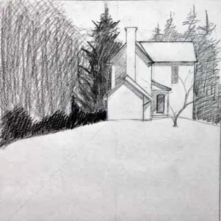
Here is one of Bill Vrscak's sketches as he begins to develop a painting.
SKETCHING: For Vrscak, the best compositions are developed via sketching and simplification -- to him a painting should not be an exact copy of a scene or subject because that's what photography is for. Instead, painters must remember that what is on the surface of the paper is far more important than what the painter is seeing.

So, Vrscak  pares down the subject matter and looks for what he finds vital. And one area in the composition should be of greatest importance -- this is the point of entry for a viewer  and everything else is secondary. Sketching helps a painter develop that entry point and then simplify the rest of the scene. As you can see in the photograph of one of his sketches (shown above), there's nothing elaborate about the sketch. It's a road map of sorts -- the relative shapes of the masses have been worked out, there's a hierarchy of dark and light values, and the overall composition within the frame has been established.

A painting in progress, reflected in the overhead mirror.
Here you can see Vrscak's limited palette.
THE PALETTE: Next, Vrscak only uses six colors on his palette - a split primary palette composed of a warm and cool version of Yellow, Red and Blue. The colors he used in our workshop, listing the cool version in each pair first followed by the warm version, were Aureolin and Cad Yellow, Permanent Alizarin Crimson and Cad Red, and Winsor Blue (Green Shade), and Ultramarine Blue.

He said he will mix those up from time to time, substituting Cobalt Blue for Ultramarine, for instance, and maybe he will add some specific color to the palette, such as a earth color, for a particular subject. But for the most part, his large, white palette had mostly empty wells. He said he went to this limited palette some time ago because he wanted to simplify his color mixes and concentrate more on values. The limited palette also makes it easier for him to replicate color mixes, and after years of using it, he knows exactly what ratios of which colors will produce what he needs at a given time with minimal fuss.

Photo by D. Byron Witt and used with permission.
Bill Vrscak
Photo sourced from Morgantown Art Association's Facebook page:
https://www.facebook.com/pages/Morgantown-Art-Association/304517989577522
THE BRUSHES: Vrscak says he likes flats, and he specifically likes flats with extra long bristles. Often marketed as "one stroke" brushes, I found these brushes to be a revelation. I've always liked the look of paintings that obviously were created using flats -- but when I have tried to use flat wash brushes, they have always felt too stiff and seemed to pull off as much pigment as I was trying to put down. I have a massive collection of flat brushes that I have purchased and then set aside because I did not like how they felt.

However, these "one stroke" versions have a much softer feel, more like a nice pointed round. Vrscak said he likes them because of the amount of pigment they can hold. The fewer times he has to go back into his palette to pick up pigment, the better. They also have nice spring and flexibility and can make great "marks." He uses the edges in smaller areas and tries to use as big a brush as he can for as long as he can. He warns that relying on only small brushes leads to excessive concern for the detailed areas, and a loss of vision of the painting as a whole.

In this demo painting by Bill Vrscak, broad washes went down first, followed by a limited number of detailed marks. An obvious entry point, nice value contrasts, interesting contours, and just the right amount of texture make this a wonderful example of a watercolor painting. I am very proud to say that I am now the owner of this painting!!!
THE PAINTING: As for the painting itself -- Vrscak works to establish the big areas first with broad washes applied with big brushes, and he gets most of the white of the paper covered quickly, because it helps him to make more accurate value judgements He also establishes a dark early in a painting's development for the same reason.

He slants his paper as a way of controlling washes and eliminating back runs, and he aways makes subtle changes in the color mixes of the large washes. A good example of this is in the photo above with the distant mountain to the right. A slighter pinker color grades into a greyish green to the right, with a touch of a greyish purple at the base. It's simple, yet so effective. Many more slight color shifts can be seen in the large foreground area. These touches help keep large washes from becoming boring and flat, yet they are subtle and don't distract from the focal point. The overall effect is a feast for the eyes.

Vrscak's goal with the really large areas is to get something down on the first application, make it look interesting, and not go back into it. And that's the secret of "fresh" watercolors. Don't mess with it!

As the painting moves along, smaller brushes are used to develop the important bits of the painting, but only those most important parts get special treatment and more work. Vrscak reiterates that getting too concerned with all the details all over a painting means that you have lost the focus of the painting.

Here is another demo painting by Bill Vrscak from the Morgantown workshop. This painting still has more development in store, but you can see just how much can be accomplished with the skillful application of large value masses.
FINALLY: More good advice from Vrscak: Make interesting washes, interesting shapes and interesting contours. Accept that a watercolor is a simply a collection of flat shapes and marks and that they must relate to one another for a painting to be successful. So arrange the marks in a pleasing way and keep it simple!

This really was a wonderful workshop for me, and it came at the right time in my development as an artist. I'm beginning to get a sense of what I'm good at doing, and I really enjoy playing with and controlling compositional elements now, so much of what Bill Vrscak offered us in the way of advice and ideas was exceptionally helpful to me. I absolutely would attend another of his workshops and would encourage any watercolorist at any level to take from him as well. He is a great teacher as well as being a great painter, and that is a combination that I really admire.


Monday, May 27, 2013

Watercolor class


I've agreed to teach a watercolor class for beginners through the Grant County Arts Council in Petersburg, W.Va.

Most of the GCAC classes are for a couple of hours each day over the course of 4 to 5 days, but since I work, I asked if I could do the class in more of a workshop setup, over a weekend.

GCAC agreed, and so the class is listed in their 2013 schedule as:
"Beginning Watercolor, Saturday, June 22 from 9 a.m. - 4.p.m. and Sunday, June 23 from 1 - 4 p.m. 15 years old and up"

I admit it's going to be a little rough getting everything in during that time period -- I'd like to have a couple more hours, which would fit the sort of classes I used to teach for the Hardy County Extension retreat at Camp Pinnacle, but I'll make it work. I'll just have to trim out one of the exercises in mixing colors.

I don't know what GCAC is charging for the class, though I'm sure it's very affordable. They have not posted any of the classes on their website, but I know they have been advertising their summer classes in the local paper, "The Weekender."

If you'd like information about the watercolor class, or any other classes GCAC might be offering, contact GCAC at P.O. Box 988, Petersburg, WV 26847, or email them at GCArts@gmail.com.

Sunday, May 26, 2013

Art at VMRC


"The Red Shed" - 8"x8"
I'm happy to report that I'm back at the Virginia Mennonite Retirement Community's annual multimedia exhibition with "The Red Shed." The exhibit opens today at the Park Gables Gallery at the VMRC complex in Harrisonburg, Va.

Art at VMRC is a top-notch show -- it features a panel of respected jurors, a beautiful space that draws truly interested visitors, and extraordinary management and care by the volunteer organizers of the exhibition. And, because of the widespread call for entries that appears in national magazines and  online listing, the quality of the selected work is outstanding, and covers a wide range of mediums and styles.

This is the third time I have entered, and the second time that I have work accepted (I had two pieces in the 2011 show). And I pinch myself when I receive the letter saying that I've made it.

The show dates are May 26 through June 30, 10 a.m. to 7 p.m. each day.

The awards reception is next Sunday, June 2, from 2 to 4 p.m.

For more about the show, visit the VMRC website at http://www.vmrc.org/v.php?pg=48. This site includes a link to a pdf file where you can see images of the pieces included in the 2012 show.

I can't wait to see what the exhibit will include this year!

Tuesday, May 21, 2013

ArtScape in Winchester


"Yellow Wings" - 14"x11"
Continuing with updates (I've not done a good job of posting in quite a while), my "Yellow Wings" painting was accepted in the 2013 ArtScape program in Winchester, Va. This is the first year that I have entered a painting for review.

Now in its fifth year, ArtScape is a collaborative effort between the Shenandoah Arts Council (www.shenarts.org) and the Old Town Development Board/City of Winchester (www.oldtownwinchesterva.com). Artists submit images, and jurors choose the winning submissions. Entries include paintings, photographs and images of 3-dimensional pieces.

The winning pieces are then delivered to the arts council, where they are photographed by a professional photographer. In the meantime, local organizations and businesses are invited to view the original artwork, and they select which pieces they would like to sponsor.

All of this comes together with the creation of banners that include the artwork, the artist's name, and the sponsor -- and then these banners are displayed from light posts in the Old Town area of Winchester, mostly  on the pedestrian mall at the heart of the downtown. The idea is to create an outdoor gallery for the public to enjoy.

Later in the summer, the original artwork will be auctioned off at a fundraising event for the arts council, with  proceeds divided between the artist and the arts council.

So, with all that said, here are images of my banner, sponsored by Blue Ridge Hospice (http://www.blueridgehospice.org). Blue Ridge Hospice uses a butterfly as part of their corporate imagery, which is why they were interested in my painting.


I took these photos right after the banners went up along the mall. The workers have since straightened the banners so they don't tilt at the awkward angle you see in the lower image.

The ArtScape program went through a host of difficulties this year with the extensive renovations to the Loudoun Street Mall earlier this year. There were many unknowns when they released the call for entry. As it turns out, the new light posts are shorter than the old light posts, so that required a redesign of the banner sizes and orientation. They are much smaller than they had been in previous years, but I hope that things can be worked on next year to make them larger.

If you are traveling through Winchester, stop downtown and take a stroll along the pedestrian mall. My banner is on the south end of the mall, near the Godfrey Miller Home.

Saturday, May 18, 2013

Side Alley


Side Alley - 8"x8"
So another piece of the Wardensville series is done. I really like the colors with this one...perhaps Bill Vrscak is right with his limited split primary palette! I know that I really struggle with mixing greens, so I want to play with this concept more and see if it helps solve some problems that have halted my progress on some paintings.

Now, regarding my news about this series....in addition to the small showing of the paintings at the Wardensville High School alumni dinner in September, I am donating one painting to the Wardensville Scholarship Fund Association. I'm still not sure if they have decided on a silent auction, a live auction, or on chances, but the proceeds from the sale of the donated painting will benefit the scholarship fund.

The subject of this painting will be the old Wardensville School -- I won't reveal more than that yet. Stay tuned to see how it looks!

Sunday, April 21, 2013

Alley


Here is an in-progress shot of another painting in the Wardensville series...I'm trying out some ideas from the recent Bill Vrscak workshop I took at the Morgantown Art Association. You can see some of Bill's wonderful paintings at his website www.billvrscak.com.

Bill uses a split primary palette - warm and cool versions of yellow, blue and red. He also stresses the use of value sketching to develop compositions, and believes that the best paintings come from the worst references -- the more the artist has to create to make a composition work, the better. Otherwise, he wonders, why go through the effort of painting a scene from a beautiful photograph? The photographer has already done the work and there's little that the artist can add to the scene.

I filled up a small notebook as he talked and worked on demo paintings -- he shared so many wonderful ideas with the group. I need to sit down and retype everything to help me digest all of the useful information.

There is good news regarding the entire Wardensville series that I'd like to share. I'm going to have a small showing of the paintings at the Wardensville High School alumni dinner this fall. I thought it would be a good venue with folks who know the town intimately. I hope the group will enjoy my efforts to bring life to the scenes we often overlook.

There's another announcement regarding the alumni dinner that I'd like to make, but I think it deserves its own post...stay tuned!

Sunday, March 17, 2013

Shadow Play

"Shadow Play" - 8x8
Well, I just finished the second (or third?) painting in the Wardensville series.

As usual, my emotional pattern remains intact - high hopes at the onset, an early setback where I think I've ruined it, a stubborn refusal to quit, a rescue and recovery mission where my hopes take flight again, and then a slow, anti-climatic finish, and finally some disappointment.

I suspect this is how every artist feels during the process of every painting. Why do we go through this? I think most painters I've talked to say it's the process and the vision, but rarely the results, that provide the rush we crave.

Sunday, February 3, 2013

Joy

"Joy" - 8"x5"

Finished!

I've been working on this rose as a commission since the start of the year. Once again, I decided to challenge myself with yellow and, as usual, yellow put up one heck of a fight. See my earlier post on yellow to learn more.

The primary yellow here is MaimeriBlu's Permanent Yellow Lemon (PY175).

Benzimidazolone Lemon is considered lightfast, which is why I chose it for this rose. It's difficult to find a transparent cool yellow that is lightfast, meaning it won't fade or shift to an unsaturated gray after prolonged exposure to light.

The other pigments I used were W&N's Permanent Rose and Cobalt Blue.

This is the second painting I've done of late where I've confined myself to a traditional triad of Blue, Red and Yellow. As was the case for "Red Shed," it's hard for me to work in this way. Cobalt Blue always seems so gummy when I use it for shadows -- and since the yellow is so dominant here, I felt as though I was fighting the little grainy flecks in every dark area.

In contrast, using the Lemon Yellow with Permanent Rose made for brilliant orange mixes...the best I've seen in any of my paintings, in fact. So this mixing discovery is one positive I will take from this project.

I hope my client enjoys the painting!