Saturday, January 2, 2010

For Jason and Miki

I was asked to complete a commission as a gift for some family members.

Now that it's January, the gift has been opened, and I can discuss the painting. I also took some work-in-progress photos to share.

The commission was a surprise for Christmas, so I had to do some covert reference work to obtain photos of Jason and Miki's house.

Once there, I realized that the positioning of the house and the slope of the yard was going to make it difficult to capture the structure in a single shot. At the request of Jason's mom Mary, the painting was to be a straight-on vantage point, so I couldn't resort to my usual corner shot to fit everything into the scene.


This odd-looking shot is actually a panorama scene created in Photoshop by meshing together several images of the house. Thus, the fish-eye lens effect. It's the first time I had used the panorama feature, and now I understand that to make it work more effectively, I should have walked along the front of the house and maintained an equal distance parallel to the house to take the shots.

Instead, I stood in a single spot, and turned my body for each of the shots (I think there were four in all). The mix of angles really magnified the distortions.


To make sense of all the conflicting angles, I used grid paper when I drew the first sketch of the house. That helped me establish parallel lines and develop appropriate proportions. Because of the awkward source shot and the confused horizon line, some of the vanishing points and angles are inaccurate, but I think I was able to get most of the structure situated in a realistic rendition.

Sunday, December 20, 2009

Midwinter Series 2


This is the second of my barn images for my Christmas cards this year. This scene doesn't feel as cohesive for me as the first one, but I tell myself they are just little cards...it's hard to get details and the like set up correctly on this scale, or at least it's difficult for me.

I wonder how miniature painters do it....particularly those who work with watercolor.

Both scenes are on 140# Arches cold press.

Merry Christmas to everyone!

Sunday, December 13, 2009

Midwinter Series


I did a series of cards several years ago that I first called the "Snowy Barns," and then, when I had them professionally printed, they turned into the "Midwinter Series." That first set of four images perfectly fit selected lines from Christina Rossetti's "In the Bleak Midwinter."

By now, the Snowy Barns (can't help but still call them that) have become my annual Christmas card subjects. I really procrastinated on setting up this year's cards, and finally had to resort to taking them to work to get them finished (I have a small dead period at the end of the night, and that half hour for a couple of nights did the trick).

So, here is the first of the barns for this year. This is my favorite of the two. My husband prefers the second, which I'll post soon.

Monday, October 19, 2009

Iris mini in progress


Another of the iris miniatures. This is the one that I mentioned in an earlier post . . . I have not made any further progress on it.

This mini is on 300# Arches cold press. I don't have a lot of experience with 300# paper; it absorbs water and pigment in a much different way than 140#, so it's been interesting to apply wet-into-wet techniques -- but it also takes a very long time to dry.

An advantage to the heavy-weight paper is that I don't have to tape the paper down, plus I have torn the edges to create a natural effect, with paint going out to the edges. It has bowed slightly as I have worked on it, but once I'm done, I can flatten it by wetting the back and placing it between some heavy weights.

Friday, October 9, 2009

Watercolor class recap


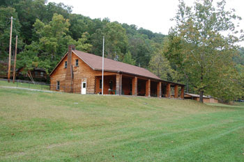
The class for the women's retreat was held in Dodd Hall at Hardy County's Camp Pinnacle. The building serves many purposes for the camp, including dining hall, assembly hall, and casual hang-out. The camp itself is in a secluded space between a mountain ridge (topped by the rock formation known as Pinnacle) and the overflow channel of Lost River/Cacapon River.

Lost River, one of West Virginia's natural wonders, goes underground near the camp, and when the river rises again on the other side of Sandy Ridge, it is known as the Cacapon. But not all the water can fit within the underground cavern that carries the river's flow. In rainy seasons and during floods, a rocky channel around Sandy Ridge carries the excess water to the head of the Cacapon.


The first night of the session was devoted to a discussion of watercolor materials and methods, including exercises where I had the ladies practicing flat washes, graded washes, glazing washes, and experimenting with wet-into-wet washes. We also worked through creating different brush strokes by varying the angle of the brush and the pressure used during the stroke, as well as having fun with watercolor resists: crayon and masking fluid. The ladies also loved splatter techniques, backruns, and salt for mottled effects.

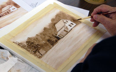
These exercises, using single pigment color (VanDyke Brown in the Cotman line), were then used the next morning to complete a landscape. In the photo above, Kathy has nearly finished her painting, and is adding one more tree shape to balance her composition.


After completing the one-color landscape, we moved into a discussion of mixing colors. Mostly I wanted to stress that, in watercolor, there are different ways to mix colors, whether by mixing on a palette, mixing wet-into-wet on paper, on glazing one color over another already dried on paper. So we completed some experiments of mixing an orange from Alizarin Crimson Hue and Cad Yellow (all Cotman) in the three ways, and compared and contrasted the results from each.

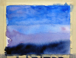
This led into a more abstract landscape where we created a mountain scene under the multi-colored sky of a sunset.

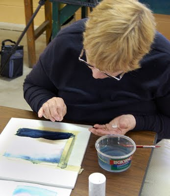
We completed one set with sky colors ranging from Indigo, to Thalo Blue, Alizarin Crimson Hue, and Cad Yellow, all added in a wet-into-wet style so they would blend. When this dried, we added the mountain range shape in Indigo, and then spiked the base of that shape with some VanDyke Brown to add the suggestion of foreground ridges.

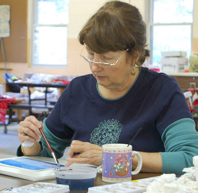
After completing that project, I gave the ladies new sheets of paper and had them try their own versions of a misty mountain landscape. Above is Judy working on her project, as well as a closeup of what she was working on. She wanted to add the purple areas to suggest even more distant mountain ranges and, she admitted, because purple is her favorite color.

Here, Kathy is applying some salt to her second mountain landscape. Several of the ladies tried this technique, some with good results. The trick is to add the salt at just the right moment. If the paint is too wet, it creates large blotches, too dry and the salt doesn't work at all. I told them I rarely use the technique myself because I have difficulty gauging the timing.


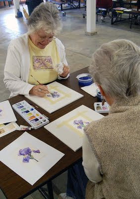
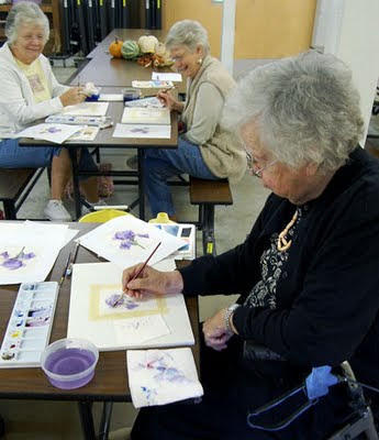
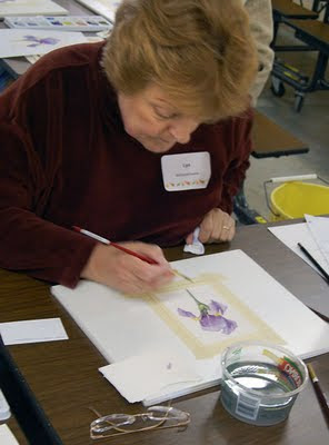
On the last day of the class, we tackled a floral. Using a color copy of one of my iris studies as a reference, the ladies began placing light washes of a mixed purple onto the paper to define the basic petal shapes. We had mixed the purple from Alizarin Crimson Hue and Thalo Blue, and had created two versions: One with more red for a warmer look, and one with more blue in the mix for a cooler version. Alternating these different purples around the petals adds more interest and depth into the shapes. Here, Lois and Fern work on their irises using the two colors.


Here, Mary concentrates on darkening shadowed areas of her iris petals. The ladies had to add color glazes in light layers on each petal, and carefully manage the edges of their glazed washes to create smooth transitions between light and dark areas.


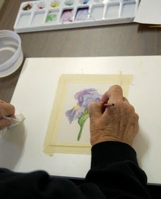
A closer view of Mary's iris shows a different stroke technique. Mary admitted to being a "dabber," feeling more comfortable with short strokes. In the case of the iris, that method created a unique textural effect that made her blossom look more like one of the heavily ruffled varieties of bearded iris.


As the class draws to a close, Lyn finishes with some details in preparation for applying light veins over the petals, the final step in making the bloom appear realistic.

It was a busy three-day session, marred by my clumsiness (I twisted my ankle, and had to teach a good portion of the class while sitting down), but I think that the final results for everyone were encouraging.

Again, I want to thank my pupils for their patience and enthusiasm for the projects. I also want to thank the retreat organizers, particularly Miriam, Susan, and Helen, for a great time!

Thursday, October 8, 2009

Class was a success!


I couldn't stand back far enough to get everyone into this frame (my sixth student, Kathy, would be at the far left), but I want to thank Judy (from left), Lyn, Lois, Fern, and Mary for a great weekend at Camp Pinnacle.

These six marvelous ladies completed a series of preliminary exercises that complemented several painting projects: two landscapes and a floral.

I have several photos of the class to post, and I will do that very soon. I believe that the class accomplished my primary goals: To encourage the participants to continue painting with watercolor, and to provide them with basic knowledge and tools on which to build skills.

Wednesday, September 23, 2009

Class is filled!

Got word from one of the Hardy County Women's Craft Retreat organizers that my class has reached its maximum quota: Six ladies who have signed on for a watery adventure next weekend, beginning on Oct. 2.

Susan also told me I have one of the biggest classes. Not sure if I am pleased or worried about that added pressure ;-)

I've got another iris miniature in progress as I warm up for the class. I'll get that posted soon.

Monday, September 21, 2009

Iris miniature


Work on the painting of my dad's house has come to another screeching halt. Can't carve out a large enough chunk of time to focus on the project, so I'm back to quick miniatures, part of my exchange with my friend Mary.

I think I've painted this same iris six times since May. Each miniature has been very different. So that's been fun, to take the same source and add something new to it each time. I understand now why some artists love to paint series. This is my version of a mini-series.

I like the super-bright highlights on the edges which make this flower look backlit. The source photo shows the bloom in soft, even light, so I'm pleased to create my own reality for this scene.

Saturday, September 5, 2009

ROUGH drawing


Here's a rough drawing that sets up the horizon line, lighting angle, and main composition elements of "Our House," so to speak. This is the project I've doing for my dad -- that's taking me years to complete.

I may yet tighten the frame, and eliminate some of the extra foreground space. But finally, I have something down on paper.

I do like the lighting angle, though. I think it will add a golden glow to large areas, and contrast nicely with cooler shadows, particularly in the large pine next to the house. I imagine this as late afternoon, early evening light.

Sunday, August 23, 2009

Teaching a class


Well, it's official. I am teaching a beginner watercolor class as part of a women's art and craft retreat at Camp Pinnacle sponsored by the Hardy County Community Educational Outreach Service (CEOS), an affiliate of the West Virginia University Extension Service. The retreat begins Friday evening, Oct. 2, and runs through Sunday, Oct. 4.

Here's the description of my class, from the retreat information form:

Watercolor Painting - Students will learn about watercolor painting materials and techniques for applying paint to paper. Using these basics, students will complete a small landscape. Once familiar with tools and techniques, students will then learn about mixing colors, with another small landscape as an end result. If time permits, we'll finish up with a small floral painting which will incorporate all the class lessons.

I'm nervous about teaching a class to adults, but I'm telling myself that my class with teenagers last summer at 4-H camp went well, and that this class should follow the same pattern.

My qualifications, for anyone interested in taking the class? I am mostly self-taught, but have years of experience with watercolor, having been painting almost exclusively with the medium for about 18 years. I have taken workshops with skilled painters, including Kay Gillispie of Elkins/Arborvale, W.Va., Ron Thurston (AWS) of Pittsburgh, Vivian Ripley of Columbus, Ohio, Catherine Hillis of Purcellville, Va., and most recently Lynn Ferris of Berkeley Springs, W.Va.

I am an affiliate artist with the David L. Dickirson Gallery at Tamarack: The Best of West Virginia in Beckley, W.Va.

As for my subjects, I am interested in realistic scenes, mostly landscapes and some florals, and the interplay of light and shadow is what attracts me to painting.

I want to stress that this class is for beginners. I want to teach participants about watercolor tools, how to select brushes, papers, and paints, and other necessary items, like tapes and boards.

Then I will go over paint applications, then discuss color mixing.

I provide all materials for the class. I just need six enthusiastic students.

To see my work, or to download a registration form for the retreat, go to my Web site: www.waitesrunstudios.com

Other classes at the retreat include knitting, tapestry weaving, flower arranging, chair caning and more! A range of lodging options is offered, and costs are very economical. Full lodging and all meals costs $75.00, and cheaper options, including half-day classes, are available. All the classes have a small materials fee (my fee is $11, which covers the costs of paper, paint, etc.)

Camp Pinnacle is just west of Wardensville. From Wardensville, traveling west, turn right onto Pinnacle Drive about 1 1/4 mile after the 4-lane section of W.Va. 55 (Corridor H) begins.