Thursday, March 11, 2010

Yellow with fear


Well, I've started a new Lunchtime Painting, and I've listened to the challenge of a friend who told me I should try an iris in a different color.

Well, here it is, and boy it's been difficult.

I have never attempted to mix much with yellows before, and creating neutral tints for the shadows, etc., has been problematic.

Lesson learned: You can make some really sickly colored tints with yellow if you don't know what you are doing.

Sunday, March 7, 2010

A happy ending


It was a happy ending for me, at any rate. Very pleased with this one, and I enjoyed having such a detailed record of the process so much that I finally worked out how to create an Adobe Flash slideshow just for the occasion.

If you visit my Web site, www.waitesrunstudios.com, I've created a new entry page that features the Flash movie, with each stage of this painting softly melting into the next. I find myself watching the movie for long periods of time. I'll focus on some particular section, a portion of a fall, for example, and watch how that little section changes. Then I'll move to another small area and repeat. It's hypnotic.

Thanks to my friend Roger, I also might have a name for these minis that I complete while on my lunch hour. "Lunchtime Paintings," was his off-hand suggestion. I rather like the sound of that, but I wonder if anyone else has some ideas. Speak up, if you do.

I want to keep working on little projects during lunch (and have already started another iris). When the weather improves, I'd also like to wander downtown and do some plein air sketches from time to time.

The end result feels greater than this little painting. I feel enthusiastic about painting, for the first time in months, and keep thinking of ideas and experiments that merit further exploration.

Lastly, thank you, Eleanor, for your kind words about the penultimate stage of this mini. I hope the end result doesn't disappoint?

Friday, March 5, 2010

Wait for it!


Okay, sorry for the unoriginal misuse of the classic Monty Python line in the title. But, just as a tease, let me say that I'm REALLY happy with how this mini wrapped up. Yes, I'm working one image ahead of the blog, but let me encourage you to check out the next post to see the final image.

However, back to the image in this post . . . I continued to glaze into the darkest areas to highlight contrasts and create depth in the form.

At this point, most of the formative glazes are finished. What remains is the critical addition of veins into the standards and falls, and from the several irises I've painted over the last few years, that final step is what really determines the realism in the flower.

So, stay tuned!

Thursday, March 4, 2010

Pleased so far


So far, this mini feels successful. I think I have better contrast in the standards and falls, and I think the shape feels much more dynamic. I like how the positive and negative space interact. Essentially, it's a diamond in a rectangle.

It might be a little too centered, but I don't think it feels static. The structural shapes within the iris provide movement.

Tuesday, March 2, 2010

Progress


The background was the first thing I did on this mini, and, as you can see from these updates, I haven't changed it. It was completed wet into wet, and I mixed the colors on the paper rather than on my palette. Mostly it's Thalo Green and Perm. Alizarin Crimson, with splotches of New Gamboge.


As for the color of the iris, it's a mixture of Ultramarine Blue and Permanent Rose. I pre-mixed two purples from these pigments, one warmer and one cooler. I use the two to create depth by pushing some of the petals (technically standards and falls) to the foreground, and others to the back. It's the technique I used in my class last fall, and using two color temperatures also creates more energy and interest.

Monday, March 1, 2010

Step-by-step mini


I've switched from a night to daytime work shift, which includes a required one-hour lunch break. The first week or so, I had great difficulty dealing with the break...I wanted something to do.

Then I decided to continue on another iris mini while on my break. So last week, for the first time in ages, I painted every day, and the hour for lunch FLEW by!

Time is still limited. By the time I eat my sandwich and then get out my supplies and water dish, I only have about 40 minutes for painting. Then, with the slower drying time of the 300# paper, I'm limited further still, but it's been such a relief, even if my time is so short. I wouldn't want to tackle anything larger than these minis on such a limited schedule.

Each night I've recorded the progress from each day, so I have a detailed, step-by-step series of photographs. I'm working in Flash to create a slide show that shows the iris forming right before your eyes, but with Blogger, I have to content myself with sequential images.

So here's the first stage, with several more to come.

Thursday, February 4, 2010

Iris mini finished


After months of neglect, I finally pulled out the Iris miniature I had been working on in October and finished it. Because of the gap between posts, I've included the original work-in-progress image at the bottom.

As I said back in October, this is on 300# Arches cold press. It's about the size of a baseball card, so about 2.5 by 3.5 inches.


I had a tough time getting used to the absorbency of the paper, especially with the wet-into-wet background I developed.

Monday, January 11, 2010

Final changes for Jason and Miki


At this point I continued to work on defining elements of the house, darkening the porch area, adding the stone textures around the base of the house and porch, strengthening the cast shadows, etc. I also added the shrubbery around the house and added highlights and shadows to the foliage.

I also removed the masking from the porch railings and step handrails, and added the fine details in the windows.


Here's the final image of the house, with the foliage in the background darkened. I used a bit of splatter in the second stage of the foliage, and carefully masked off the house and portions of the sky to safely add the splatter. Simple pieces of cut and torn paper fulfilled that need.

I have placed a transparent watermark across the house, so the strange highlights in the porch are part of that watermark.

A message from Miki indicated that they were happy with the house portrait, so that always pleases me.

Tuesday, January 5, 2010

First washes in house portrait


These are the first washes I applied after transferring the grid drawing to my watercolor paper using my light box.

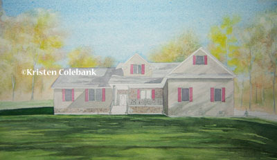
I struggled with the foreground, given the sense of slope, and all the shadows. My first attempts looked awful, with squiggly shapes dominating everything. It was too busy, mostly resulting from my attempt to freelance those washes. I ended up scrubbing nearly all of the foreground away, and starting over (I'm so glad that Arches paper is durable).

My next attempt at the foreground started with some light pencil outlines of the main shadow shapes, and followed by careful application of paint in those areas with a smaller brush. Experts always say you should use as large a brush as possible, but I always get into trouble when I try to work that way. So I fell back to my dependable No. 6 round, and softened some of the shadows' edges as I worked.

When that dried, I applied additional washes over the lawn, darkened some areas of the shadows, and scrubbed away some other areas to soften the edges. Thank goodness the area seemed to come together this time.

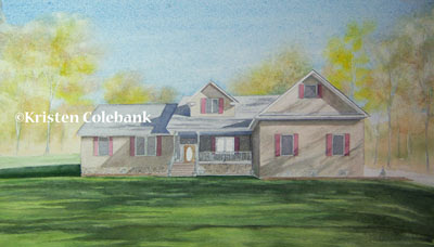
The background was completed by wetting the entire upper half of the paper, excluding the house shape, and applying Cerulean Blue for the sky. Then, while that was still wet, I dropped in mixtures of Cad Yellow, Burnt Sienna, and Hookers Green to create soft blossoms of foliage. Some of the tree trunks were masked out prior to the wash applications.


Next, I continued to define shapes within the house, particularly with the first shadow washes. I mixed the shadows on the siding with a host of pigments....can't completely remember what I used now, but I struggled to keep them somewhat warm so they would mesh with the siding. I also worked hard at trying to vary the density and edges of shadows on the right section of the house that were cast by nearby trees. Variations there were necessary to make the shadows realistic.

Saturday, January 2, 2010

For Jason and Miki

I was asked to complete a commission as a gift for some family members.

Now that it's January, the gift has been opened, and I can discuss the painting. I also took some work-in-progress photos to share.

The commission was a surprise for Christmas, so I had to do some covert reference work to obtain photos of Jason and Miki's house.

Once there, I realized that the positioning of the house and the slope of the yard was going to make it difficult to capture the structure in a single shot. At the request of Jason's mom Mary, the painting was to be a straight-on vantage point, so I couldn't resort to my usual corner shot to fit everything into the scene.


This odd-looking shot is actually a panorama scene created in Photoshop by meshing together several images of the house. Thus, the fish-eye lens effect. It's the first time I had used the panorama feature, and now I understand that to make it work more effectively, I should have walked along the front of the house and maintained an equal distance parallel to the house to take the shots.

Instead, I stood in a single spot, and turned my body for each of the shots (I think there were four in all). The mix of angles really magnified the distortions.


To make sense of all the conflicting angles, I used grid paper when I drew the first sketch of the house. That helped me establish parallel lines and develop appropriate proportions. Because of the awkward source shot and the confused horizon line, some of the vanishing points and angles are inaccurate, but I think I was able to get most of the structure situated in a realistic rendition.