Wednesday, November 27, 2013

Stephens Fort at Old Forge Farm

"Old Forge Farm"
I did this little painting as a thank you to my friend Jimmy.

Jimmy's family owns a remarkable farm that includes several buildings that pre-date the American Revolution. It was the site of an "iron plantation," one of the earliest manufacturing sites in the Northern Shenandoah Valley, operated by Isaac Zane.

Jimmy hosted us on a tour of some of the property, as we searched for bits that would indicate the location of the iron furnace. Its massive stones were hauled off prior to the Civil War for other building projects. But evidence of "slag" - the glassy byproduct of early iron production practices - and charcoal were everywhere. It was a fun visit, and our group was very appreciative of Jimmy's willingness to host us.

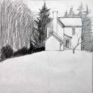
This scene shows what is known as "Stephens Fort," with the historical manor house in the background. Based on its design, and because of its similarities to another structure that I've seen in Elkins, W.Va., I think it was used as an "ice house" for storing perishables. There are two subterranean levels - reaching more than 24 feet below ground - and the shape is hexagonal on the surface (you only see two sides in this scene) and round below ground.

The remarkable structure is called "Stephens Fort" because it is widely believed that it was used as a shelter for local families during Indian raids in the period of the French and Indian War. Many sorts of structures were used as "forts" during this time period, including sturdy log cabins such as Fort Ashby in Fort Ashby, W.Va.

Thank you again, Jimmy, for being such a great host and friend.

Monday, October 21, 2013

Solitude

"Solitude" - 8x8

So after many hesitant revisions, this little painting joins the ranks of the Wardensville series.

In many ways, this project may be the closest I've come to following Bill Vrscak's advice: (see my earlier blog post on Bill Vrscak) ..."the best compositions are developed via sketching and simplification -- to [Vrscak] a painting should not be an exact copy of a scene or subject because that's what photography is for. Instead, painters must remember that what is on the surface of the paper is far more important than what the painter is seeing."

Well, given the quality of my source photograph, sketching and simplification were my only options.


I took the photo with my cell phone while on a morning walk. I don't know what attracted me to the scene, given all the obstacles between me and the focal point. But I know that I often see "glimmers" of paintings as I walk and/or drive around. If I pause and look more closely, the vision seems to vanish. So I'm beginning to trust my instincts, snap a photo, and ask questions later.

So here was my first simple sketch of the scene:

First sketch
It's very rough, but what I liked was the contrast between the background foliage shapes and the hard white geometry of the house.

Working to refine the shape of the house, I then did this sketch. This drawing also determined the direction of the light and how the shadows were cast on the different sections on the house. Additionally, I moved the house "up" on the hill.

Second sketch
A couple of watercolor value paintings were next, which I had posted in an earlier blog entry:

Value #1
Value #2
The purpose of these little paintings was to figure out how I wanted to break up the mass of foliage that surrounds the house. I knew the contrast between the large pine to the left and the house was critical, but I wanted to play with other values around those key elements.

Now it was time to paint...


In this early stage, I tried, per Bill Vrscak's advice, to block in big shapes first. I also  tried to make the outlines of those shapes interesting, and to vary the colors within the shapes so they wouldn't be flat and boring. Since the light was hitting from the right, I used more yellows to that side, and added cooler blues as I worked to the left.

From the value paintings, I had decided to not worry about any details in the foliage, and to push it all to the background. However, when looking at the painting at this point, I began to feel that it was too simple and too boring. So I stopped working on it for quite a while, and kept thinking about it. Finally I decided that I had to lift some of the wash to the left side, and develop some sense of hanging foliage that would add depth to the foreground elements. So the next stage shows that mass of foreground foliage as it starts to develop.

Along the way, you may have noticed that I eliminated the little tree that had been growing in front of the house. I had the tree in my pencil sketches, but in distilling the lessons of those early sketches, I decided that it was the shape of the house against the dark background that drew my interest. That contrast seemed dramatic, perhaps even mysterious. Obscuring that stark contrast with the mid-ground tree seemed superfluous, so I eliminated the tree from the design.

At this stage, I had also worked to break up the foliage areas surrounding the house, and developed the foreground to add texture and interest to what otherwise could be a large boring shape.

To finish up, I strengthened the cast shadows in the house, and added some very slight touches of detail. I didn't want to fuss over the house, and I think I kept it fairly simply, yet it reads in a realistic manner.
"Solitude" - 8x8

Wednesday, October 16, 2013

W.Va. Juried Exhibition


"Mumbles and Squeaks"
I wanted to share this press release with you...because "Mumbles and Squeaks" has been accepted into the exhibition!

+++


West Virginia Division of Culture and History to Unveil Juried Art Exhibition in Martinsburg in November


MARTINSBURG, W.Va. — The West Virginia Division of Culture and History will unveil the 18th West Virginia Juried Exhibition at the Dunn Building in Martinsburg at 2 p.m. on Sunday, Nov. 24, at a reception that is free and open to the public.

Introduced by the Division in 1979, this biennial event showcases the work of state artists and craftspeople while providing the Division with an opportunity to purchase award-winning art for the West Virginia State Museum art collection.  The exhibition features painting, sculpture, printmaking, drawing, photography, mixed media and crafts, and will remain on display through February 2014. 

The West Virginia Division of Culture and History proudly presents this exhibition in partnership with the West Virginia Commission on the Arts and with support from the West Virginia Legislature, which appropriates funding for the exhibition’s awards.

The awards for this exhibition include:
·     Governor’s Awards:  Up to three $5,000 purchase awards, with one award designated the D. Gene Jordon Memorial Award.
·     Awards of Excellence:  Up to seven $2,000 purchase awards.
·     Merit Awards:  Up to eight $500 awards.  These are not purchase awards.

For more information about the West Virginia Juried Exhibition 2013, contact Caryn Gresham, deputy commissioner, at (304) 558-0220 or at caryn.s.gresham@wv.gov.

The West Virginia Division of Culture and History is an agency within the West Virginia Department of Education and the Arts with Kay Goodwin, Cabinet Secretary. The Division, led by Commissioner Randall Reid-Smith, brings together the past, present and future through programs and services focusing on archives and history, arts, historic preservation and museums. For more information about the Division’s programs, events and sites, visit www.wvculture.org. The Division of Culture and History is an Equal Opportunity/Affirmative Action Employer.

Monday, September 16, 2013

The "F" word

Yes, that's right. It's the "F" word: Facebook.

I've followed the crowd into social media. Mind you, I don't have a personal Facebook page and don't intend to create one. However, I've found more and more that artists, arts advocacy groups, and galleries are spreading the word about events, shows and more through Facebook.

So, now I have Facebook logos on my website and blog that link to my Facebook page, which is at www.Facebook.com/WaitesRunStudios.

I've been on Facebook for a couple of weeks and I've noted its strengths and weaknesses. In short, it seems most effective with images and short, snappy posts.

But, as a writer, I find that format to be a little too confining. So I don't intend to give up this blog. It's the perfect place to write about painting at length - with topics such as techniques, materials, design principles, inspiration and more.

I view the Facebook page as a way to announce events. It's also useful, I think, to introduce more people to watercolor painting,  mostly by sharing images of paintings in process. And I will use Facebook to encourage "Friends" to visit this blog to learn more about the medium.

That said, I encourage you to "Like" my Facebook page to keep up with the new nuggets of information that I share there.

Wednesday, September 11, 2013

Pittsburgh Society of Illustrators


Anni Matsick, the newsletter editor for the Pittsburgh Society of Illustrators, included a blurb about my Bill Vrscak workshop blog post in the July issue of the society's newsletter and included a photo from Morgantown Art Association member Byron Witt.

Bill Vrscak is also a member of PSI. You can read my account of his workshop at http://waitesrunstudios.blogspot.com/2013/06/bill-vrscak-workshop-in-morgantown.html

Visit http://www.pittsburghillustrators.org/ to see the entire PSI July newsletter in pdf format and to learn more about this great organization and its many talented members. Be sure to check out the website of Anni Matsick as well: http://annimatsick.com/

Saturday, September 7, 2013

School Days

"School Days" - 8"x8"

I painted this one twice.

In the first version, I got too dark too quickly in the cast shadow areas, so there was no sense of warm sunshine in the painting. When I looked at it from a distance, all I could see was a hard diagonal shape that dominated the scene.

So I tried to use opaque watercolor - in this case, watercolor mixed with gouache - to paint over it and try something different.

That experiment didn't go well. There's a strange drying shift in opaque watercolors that I can't get a handle on. Traditional watercolors tend to look dark while the wash is still wet, and then lighten while drying. Over time, you get used to this drying shift.

Once you mix the watercolors with white gouache or with opaque titanium white watercolor, then the opposite happens. They dry darker. And that difference drives me crazy. I have no sense of how anything will eventually look while I'm putting it down.

Secondly, I think the appeal of oil and acrylic paintings - at least for me - is seeing all those bits of colors that peek through, particularly with the alla prima painting technique. I could not get any such effect in my experiment because the watercolor paint dries so quickly. So I ended up with masses of sharp-edged and flat shapes that were not very interesting to look at.

An application of colored pencil over the opaque watercolor finished off that piece of paper (the cold press paper is just too rough), so I transferred the drawing to a fresh piece of Arches cold press paper and started again.

The second time I learned from my mistakes.

This image is something of a composite, which is still very hard for me to do. The scene no longer looks like this -- the doors have been removed and replaced with modern, metal-framed glass doors. But I thought it would be more appealing to go back in time and reconstruct the doors as they were when the Wardensville School was still open. I couldn't find any clear images from WHS yearbooks, so I cobbled the doors together in my mind's eye. I hope I got close.

Only seven days and the mini exhibit of my Wardensville paintings will be on display at the WHS alumni dinner. The Wardensville Scholarship Fund Association benefit auction of my donated painting is that evening too!

Monday, September 2, 2013

Value studies


I am working from a really poor photo reference, so I'm essentially making this scene up. So that should make for a good painting...if I had the skill set of Bill Vrscak. But I'm certainly not there yet, so this challenge worries me.

So, I've resorted to doing some little value paintings to try to figure out how I want to develop all the foliage around the structure. Here are two of the options.

I guess it's time to scale things up to full size...

Wednesday, August 28, 2013

Sunlit


"Sunlit" - 8"x8"

Another completion in the Wardensville series...with many more yet to go.

I'd like to talk a little bit about why I'm working on this series. I first mentioned the idea in a blog post last year (read it here), and to recap, I am focusing on scenes that I think we all overlook.

It's completely understandable that this happens, by the way. It's simply part of living in a space, whether it's as small as your desk at work or as large as your community, and becoming so familiar with the space that you become blind to it.

It's only when there is something out of place, whether it's something that's new, something that is changed, or something that is removed, that you pause and take note.

So the space that I'm focusing on is the community in which I live. So far, the most successful parts of the series, in my estimation, have been "Red Shed" and "Shadow Play" and "Side Alley." I think these scenes are all somewhat surprising, and it may take even longtime residents a few moments of reflection to recognize the locations. And when they do, I hope they enjoy a different perspective of the scene, even if it only lasts for a few moments.

Obviously, not every person seeing these paintings will know where they come from. After all, Wardensville is a very small town. So I still have to entertain those people as well, and for them I must develop compositions that are pleasing and balanced.

I really am enjoying this notion of finding the extraordinary in the everyday. I hope you may also wish to reassess the spaces around you...and find something valuable in the process.

Sunday, August 11, 2013

Old Glory


"Old Glory" - 8"x8"
I'm still working on the paintings for the Wardensville series, and trying to get enough of them done that I can do a little display at the Wardensville Alumni Dinner in September, to complement the benefit auction of my "Warriors Win" painting.

I've run into all sorts of problems with the three most recent paintings in the series. Often it seems I spend more time scrubbing pigment off the paper than putting pigment down. I hope it's just a phase and I can snap back into some more efficient painting soon. Right now, I feel really tentative with what I'm doing.

Friday, July 26, 2013

Benefit auction for Wardensville Scholarship Fund Association


The painting I did for the Wardensville Scholarship Fund Association benefit is now on display in the lobby of Capon Valley Bank, along with information about making a bid on the painting, which will be sold at auction on Sept. 14 during the Wardensville High School Alumni Dinner. All proceeds from the auction will go to WSFA.

"Warriors Win" - 12"x12"
As usual, I have stressed mightily over this painting, particularly since it's being used for this public fundraising event. So far reactions have been positive. I hope that trend continues, and I hope the painting auction raises funds for WFSA.

One of the most complicated parts of this painting was the original drawing, particularly of the basketball net. Initially, I tried to draw each strand...and ended up getting really confused. So I started over, and instead concentrated on drawing the spaces between the strands -- essentially breaking it down into a bunch of abstract shapes. That approach worked. I suppose it's the same as when you draw upside down, or in reverse, to trick your brain into focusing on raw shapes, rather than what the brain thinks it is seeing.

The other difficult part was in the development of the painting itself, as I kept battling the balance between the foreground and background elements. I used contrast and edge sharpness/softness as my main design tools in this battle. I'm still not sure how successful I have been, but in time I'll have a better sense of it. It's difficult to assess a painting when it's still under your nails and in your dreams.